2 Mathematical Statistics: Simulation and Computation
2.1 Data
Statistics and data science begin with data collection. A primary focus of study design is how to best collect data that provides evidence to support answering questions. Questions are in the form, if \(X\) changes does \(Y\) change?
In some contexts data collection can be designed so that an investigator can control how people (or in general experimental units) are assigned to a (“treatment”) group, and in other contexts it’s neither feasible nor ethical to assign people to groups that are to be compared. In the latter case the only choice is to use data where people ended up in groups, but we don’t know the probability of belonging to a group.
2.1.1 Computation Lab: Data
This section contains a very brief overview of using R to read, manipulate, summarize, visualize, and generate data. The computation labs throughout this book will use a combination of base R8 and the tidyverse collection of packages9 to deal with data.
2.1.1.1 Reading Data into R
When data is collected as part of a study, it will almost always be stored in computer files. In order to use R to analyse data, it must be read into R. The data frame data structure is the most common way of storing data in R.10
Example 2.1 nhefshwdat1.csv is a text file in comma separated value format. nhefshwdat1.csv can be imported into an R data frame using read.csv() and stored as an R data frame nhefsdf. The scidesignR package includes this text file and a function scidesignR::scidesignR_example() that makes the file easy to access within the package. The first six columns and three rows are shown.
nhefshwdat1_filepath <-
  scidesignR::scidesignR_example("nhefshwdat1.csv")
nhefsdf <- read.csv(nhefshwdat1_filepath)
head(nhefsdf[1:6], n = 3)
#>   X seqn age sex race education.code
#> 1 1  233  42   0    1              1
#> 2 2  235  36   0    0              2
#> 3 3  244  56   1    1              2
The variable names in the data set can be viewed using colnames().
colnames(nhefsdf)
#>  [1] "X"              "seqn"           "age"
#>  [4] "sex"            "race"           "education.code"
#>  [7] "smokeintensity" "smokeyrs"       "exercise"
#> [10] "active"         "wt71"           "qsmk"
#> [13] "wt82_71"        "pqsmkobs"       "strat1"
#> [16] "strat2"         "strat3"         "strat4"
#> [19] "strat5"         "stratvar"
2.1.1.2 Manipulating Data in R
Raw data from a study is usually not in a format that is ready to be analysed, so it must be manipulated or wrangled before analysis. R (often called base R) has many functions to manipulate data. R’s default packages and the dplyr library,11 which is part of the tidyverse collection of packages, provide many functions to solve common data manipulation problems.12 Both will be used together and throughout this book.
Example 2.2 The education variable nhefsdf$education.code was stored as an integer but is an ordinal categorical variable with five levels. If we want to recode this into a variable that has two levels with 4 and 5 mapped to 1, and 1, 2, 3 mapped to 0 then we can use dplyr::recode().
nhefsdf$education.code’s data type is an integer type, where the integers represent education categories. Factors are special R objects used to handle categorical variables in R. as.factor() is a function that encodes a vector as a factor. levels() extracts the levels of the factor.
2.1.1.3 Summarizing Data using R
This section will provide a brief overview of summarizing data using R. Wickham and Grolemund13 provides an excellent discussion of tools to summarize data using R.
Data analysis involves exploring data quantitatively and visually. Quantitative summaries are usually presented in tables and visual summaries in graphs. The dplyr library contains many functions to help summarise data. A common way to express short sequences of multiple operations in tidyverse libraries is to use the pipe %>%.14
The ggplot2 library,15 part of the tidyverse collection, can be used to create high quality graphics. ggplot2 and dplyr can both be loaded by loading the tidyverse package.
2.1.1.3.1 R pipes
This R code
is equivalent to
dplyr::count(nhefsdf, education.code)dplyr::count() returns a data frame. So, the resulting data frame can be “piped” (i.e., %>%) into another tidyverse function.
The code chunk below loads the tidyverse library (library(tidyverse)) so there is no need to use pkg::name notation. Below, the data frame from nhefsdf %>% count(education.code) is used as the data frame argument in mutate(pct = round(n/sum(n)*100,2)). dplyr::mutate() is used to create a new column in the data frame returned by nhefsdf %>% count(education.code), and dplyr::summarise() summarises nhefsdf by several functions n()—the number of observations, mean(age)—mean of age column, median(age)—median of age column, and sd(age)—standard deviation of age.
library(tidyverse)

nhefsdf %>%
  count(education.code) %>%
  mutate(pct = round(n/sum(n)*100,2))
#>   education.code   n   pct
#> 1              1 291 18.58
#> 2              2 340 21.71
#> 3              3 637 40.68
#> 4              4 121  7.73
#> 5              5 177 11.30

summarise(
  nhefsdf,
  N = n(),
  mean = mean(age),
  median = median(age),
  sd = sd(age)
)
#>      N  mean median    sd
#> 1 1566 43.66     43 11.99
The patchwork library16 can be used to combine separate plots created with ggplot2 into the same graphic. Hadley Wickham et al.17 provides an excellent introduction to ggplot2.
library(patchwork)

barpl <- nhefsdf %>%
  ggplot(aes(education.code)) +
  geom_bar()

histpl <- nhefsdf %>%
  ggplot(aes(age)) +
  geom_histogram(binwidth = 10, colour = "black", fill = "grey")

barpl + histpl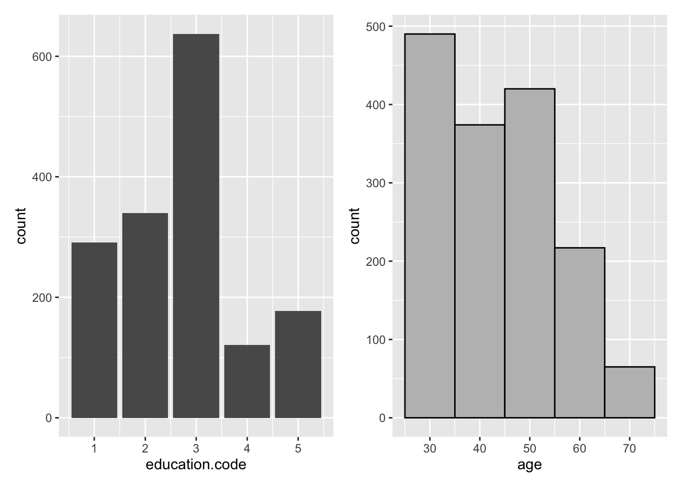
Figure 2.1: ggplot2 Examples with patchwork
2.1.1.4 Generating Data in R
Study design often involves generating data. Generating data sets can involve replicating values to create variables, combining combinations of variables, or sampling values from a known probability distribution.
Example 2.3 A data frame called gendf that contains 10 rows and variables trt and value will be computed. trt should have five values equal to trt1, five equal to trt2, and randomly assigned to the data frame rows; value should be a random sample of 10 values from the numbers 1 through 1,000,000. This example will use a random number seed (set.seed()) so that it’s possible to reproduce the same values if the code is run again.
set.seed(11)
gendf <- data.frame(trt = sample(c(rep("trt1", 5), rep("trt2", 5))),
                    value = sample(1:1000000, 10))
head(gendf, n = 3)
#>    trt  value
#> 1 trt2 387134
#> 2 trt1 900071
#> 3 trt2 883541
Example 2.4 An investigator is designing a study with three subjects and three treatments, A, B, C. Each subject is required to recieve each treatment, but the order is random.
The code below shows how expand.grid() is used to create a data frame from all combinations of subj and treat. run_order is a random permutation of \(1,\ldots,9\) that is sorted using arrange().
2.2 Frequency Distributions
A frequency distribution of data \(x_1, x_2, ,\ldots, x_n\) is a function that computes the frequency of each distinct \(x_i\), if the data are discrete, or the frequency of \(x_i\)’s falling in an interval, if the data are continuous.
2.2.1 Discrete and Continuous Data
How many subjects died and how many survived in a medical study? This is called the frequency distribution of survival. An example is shown in Table 2.1. Death is a discrete random variable: it can take on a finite number of values (i.e., 0 (alive) and 1 (dead)), and its value is random since the outcome is uncertain and occurs with a certain probability.
Age is an example of a continuous random variable since it can take on a continuum of values rather than a finite or countably infinite number as in the discrete case.
| Death | Number of Subjects | Mean Age (years) |
|---|---|---|
| 0 | 17 | 33.35 |
| 1 | 3 | 36.33 |
Example 2.5 (COVID-19 Treatment Study) A 2020 National Institutes of Health (NIH) sponsored study to evaluate if a treatment for COVID-19 is effective planned to enroll 20 subjects and randomly assign 10 to the treatment and 10 to a fake treatment (placebo). Effectiveness was evaluated by the proportion of participants who died from any cause or were hospitalized during the 20-day period from and including the day of the first (confirmed) dose of study treatment.18
Simulated data for this study data is shown in Table 2.2. trt records if a subject received treatment TRT or placebo PLA, die_hosp is 1 if a participant died or was hospitalized in the first 20 days after treatment, and 0 otherwise, and age is the subject’s age in years. The data is stored in the data frame covid19_trial.
| patient | trt | die_hosp | age |
|---|---|---|---|
| 1 | TRT | 0 | 38 |
| 2 | PLA | 0 | 33 |
| 3 | PLA | 0 | 30 |
| 4 | TRT | 1 | 39 |
| 5 | TRT | 0 | 26 |
| 6 | TRT | 0 | 37 |
2.2.2 Computation Lab: Frequency Distributions
2.2.2.1 Discrete Data
The data for Example 2.5 is in the data frame covid19_trial. dplyr::glimpse can be used to print a data frame.
dplyr::glimpse(covid19_trial)
#> Rows: 20
#> Columns: 4
#> $ patient  <int> 1, 2, 3, 4, 5, 6, 7, 8, 9, 10, 11, 1…
#> $ trt      <chr> "TRT", "PLA", "PLA", "TRT", "TRT", "…
#> $ die_hosp <fct> 0, 0, 0, 1, 0, 0, 0, 0, 0, 0, 0, 1, …
#> $ age      <dbl> 38, 33, 30, 39, 26, 37, 29, 32, 29, …
dplyr::group_by() is used to group the data by die_hosp - if a subject is dead or alive, and dplyr::summarise() is used to compute the number of subjects, and mean age in each group (see Table 2.1).
covid19_trial %>%
  group_by(Death = die_hosp) %>%
  summarise(`Number of Subjects` = n(),
            `Mean Age (years)` = mean(age))
#> # A tibble: 2 × 3
#>   Death `Number of Subjects` `Mean Age (years)`
#>   <fct>                <int>              <dbl>
#> 1 0                       17               33.4
#> 2 1                        3               36.3
The code below was used to create Figure 2.2, which shows a plot of the frequency distribution of survival using ggplot2::ggplot() to create a bar chart.
covid19_trial %>%
  ggplot(aes(die_hosp)) +
  geom_bar(colour = "black", fill = "grey") +
  scale_y_discrete(limits = as.factor(1:17)) +
  ylab("Number of patients") + xlab("Survival")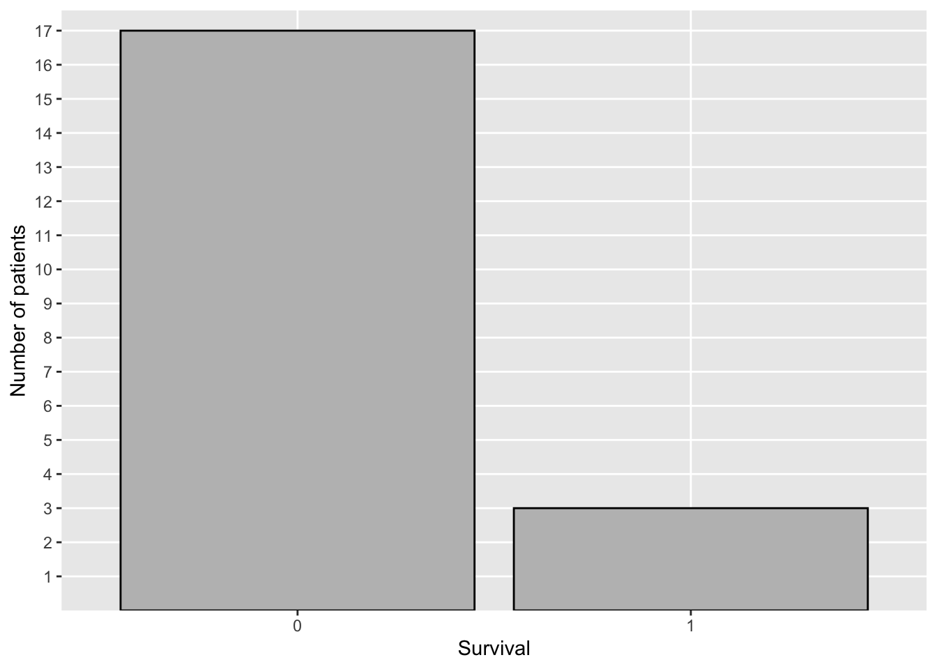
Figure 2.2: Distribution of Survival—COVID-19 Study
Is the survival distribution the same in the treatment (TRT) and placebo (PLA) groups? Table 2.3 shows the frequency distribution and the relative frequency distribution of survival in each group. janitor::tabyl(), janitor::adorn_*() (There are several adorn functions for printing—adorn_*() refers to the collection of these functions) functions from the janitor19 library can be used to obtain the cross-tabulation of die_hosp and trt shown in Table 2.3.
| die_hosp | PLA | TRT | Total |
|---|---|---|---|
| 0 | 9 (0.9) | 8 (0.8) | 17 (0.85) |
| 1 | 1 (0.1) | 2 (0.2) | 3 (0.15) |
| Total | 10 (1) | 10 (1) | 20 (1) |
library(janitor)
covid19_trial %>% tabyl(die_hosp,trt) %>%
  adorn_totals(where=c("row", "col")) %>%
  adorn_percentages(denominator = "col") %>%
  adorn_ns(position = "front")
Let \(n_{ij}\) be the frequency in the \(i^{th}\) row, \(j^{th}\) column of Table 2.3. \(n_{\bullet1} = \sum_{i}n_{i1}\), so, for example, \(f_{11} = n_{11}/n_{\bullet1}\), and \(f_{21} = n_{21}/n_{\bullet1}\) specify the relative frequency distribution of survival in the placebo group. If a patient is randomly drawn from the placebo group, there is a 10% chance that the patient will die. This is the reason that the relative frequency distribution is often referred to as an observed or empirical probability distribution.
The code below was used to create Figure 2.3 using ggplot(). The frequency distributions are shown using a side-by-side bar chart.
covid19_trial %>%
  mutate(die_hosp = as.factor(die_hosp)) %>%
  ggplot(aes(die_hosp)) +
  geom_bar(aes(fill=trt), position = "dodge") +
  scale_fill_manual("Treatment",
                    values = c("TRT" = "black",
                               "PLA" = "lightgrey")) +
  scale_y_continuous(limits = c(0,9), breaks = 0:9) +
  ylab("Number of patients") +
  xlab("Survival")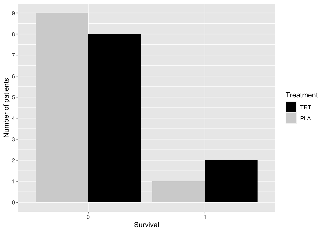
Figure 2.3: Distribution of Survival by Group—COVID-19 Study
2.2.2.2 Continuous Data
What is the distribution of patient’s age in Example 2.5? Is the distribution the same in each treatment group?
The code below was used to create Table 2.4—a numerical summary of the age distribution for each treatment group.
covid19_trial %>% group_by(trt) %>%
  summarise(n = n(),
            Mean = mean(age), Median = median(age),
SD = round(sd(age),1), IQR = IQR(age))| trt | n | Mean | Median | SD | IQR |
|---|---|---|---|---|---|
| PLA | 10 | 34.0 | 33.5 | 3.1 | 3.50 |
| TRT | 10 | 33.6 | 33.5 | 4.1 | 4.75 |
The code below was used to create Figure 2.4, a histogram of age.
covid19_trial %>%
  ggplot(aes(age)) +
  geom_histogram(binwidth = 2, colour = "black", fill = "grey")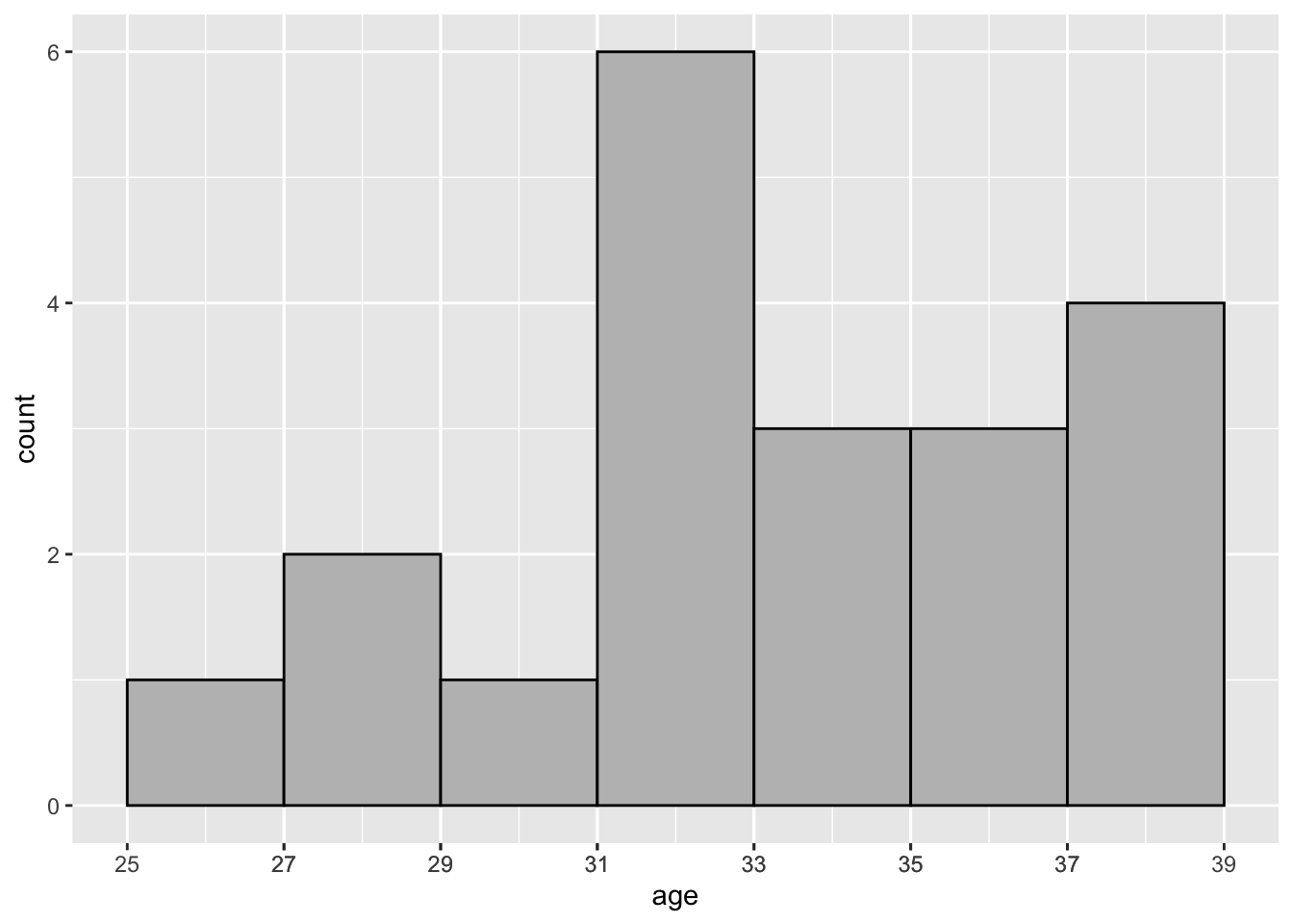
Figure 2.4: Distribution of Age—COVID-19 Study: Histogram
In Figure 2.4 the bin width is set to 2 via specifying the binwidth argument. This yields 7 rectangular bins (i.e., intervals) that have width equal to 2 and height equal to the number of values age that are contained in the bin.
The bins can also be used to construct rectangles with height \(y\); \(y\) is called the density. The area of these rectangles is \(hy\), where \(h\) is the bin width, and the sum of these rectangles is one. geom_histogram(aes(y = ..density..)) will produce a histogram with density plotted on the vertical axis instead of count.
Another popular method to visualize the distribution of a continuous variable is the boxplot (see Figure 2.5). The box is composed of two “hinges” which represent the first and third quartile. The line in between the hinges represents median age. The upper whisker extends from the hinge to the largest value no further than \(1.5*IQR\), and the lower whisker extends from the hinge to the smallest value no further than \(1.5*IQR\) where IQR is the inter-quartile range (75th percentile - 25th percentile).
covid19_trial %>% ggplot(aes(age, y = "")) +
  geom_boxplot() +
  scale_x_continuous(breaks = seq(min(covid19_trial$age),
                                  max(covid19_trial$age), by = 2)) +
  theme(
    axis.title.y = element_blank(),
    axis.ticks.y = element_blank(),
    axis.line.y = element_blank()
  )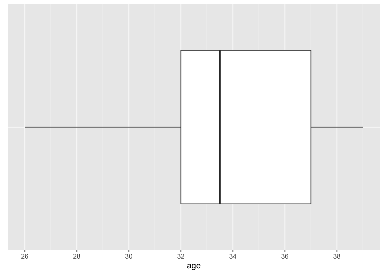
Figure 2.5: Distribution of Age—COVID-19 Study: Boxplot
2.3 Randomization
Two major applications of randomization are to: (1) select a representative sample from a population; and (2) assign “treatments” to subjects in experiments.
2.3.1 Computation Lab: Randomization
Assume for the moment that the patients in Example 2.5 were randomly selected from, say, all people with COVID-19 in the United States during May, 2020. This means that each person with COVID-19 at this place and time had an equal probability of being selected (this was not the case in this study), and the data would be a random sample from the population of COVID-19 patients.
covid_pats is a data frame that contains the id of 25,000 COVID-19 patients. The code below can be used to randomly select 20 patients from covid_pats. A tibble()20 is an R data frame that works well with other tidyverse packages. In this book tibble() and data.frame() are mostly used interchangeably. Wickham and Grolemund21 discuss the differences between data frames and tibbles.
A sample of 20 patients is drawn from the population of 25,000 patients using sample(). This is an example of simple random sampling: each patient has an equal chance of selection in the population not already selected.
When each patient agreed to enroll in the study, there was a 50-50 chance that they would receive a placebo, so chance decided what treatment a patient would receive, although neither the patient nor the researchers knew which treatment was assigned since the study was double-blind. Participants are to be randomized so that 10 receive active treatment TRT and 10 receive placebo PLA.
To assign treatments to subjects in covid_sample, dplyr::sample_n() randomly selects 10 rows from covid_sample and then creates a new variable called treat which is set equal to TRT.
The result can then be merged with covid_sample, where only rows not in trt_gp are included in the resulting merge via dplyr::anti_join().
dplyr::bind_rows() is then used to merge the treatment trt_gp and placebo pla_gp groups, and the resulting data frame is stored in covid_trtassign.
covid_trtassign <- bind_rows(trt_gp,pla_gp)The treatment assignments to four patients in the sample are shown in Table 2.5.
| id | treat |
|---|---|
| 15203 | TRT |
| 3004 | PLA |
| 2873 | PLA |
| 13558 | PLA |
How many distinct ways are there to assign 10 subjects to TRT and 10 subjects to PLA? There are \({20 \choose 10}=\) 184,756 ways to assign 10 patients to TRT and 10 to PLA. We will return to this in later chapters.
2.4 Theoretical Distributions
The total aggregate of observations that might occur as a result of repeatedly performing a particular study is called a population of observations. The observations that actually occur are a sample from this hypothetical population.
The distribution of continuous data can often be represented by a continuous curve called a (probability) density function (p.d.f.), and the distribution of discrete data is represented by a probability mass function.
A random variable is essentially a random number—a function from the sample space to the real numbers. The probability measure on the sample space determines the probabilities of the random variable. Random variables will often be denoted by italic uppercase letters from the end of the alphabet. For example, \(Y\) might be the age of a subject participating in a study, and since the outcome of the study is random, \(Y\) is random. Observed data from a study will usually be denoted by lower case letters from the end of the alphabet. For example, \(y\) might be the observed value of a subject’s age (e.g., \(y = 32\)).
If \(X\) is a discrete random variable, then the distribution of \(X\) is specified by its probability mass function \(p(x_i)=P(X=x_i), \thinspace \sum_{i}p(x_i)=1\). If \(X\) is a continuous random variable, then its distribution is fully characterized by its probability density function \(f(x)\), where \(f(x) \ge 0\), \(\thinspace f\) is piecewise continuous, and \(\int_{-\infty}^{\infty}f(x)dx = 1\).
The cumulative distribution function (CDF) of \(X\) is defined as follows:
\[F(x) = P(X \le x) = \left\{ \begin{array}{ll} \int_{-\infty}^{x}f(x)dx & \mbox{if } X \text{ is continuous,} \\ \sum_{i=-\infty}^xp(x_i) & \mbox{if } X \text{ is discrete.} \end{array} \right.\]
If \(f\) is continuous at \(x\), then \(F'(x)=f(x)\) (fundamental theorem of calculus).
If \(X\) is continuous, then the CDF can be used to calculate the probability that \(X\) falls in the interval \((a,b)\), and corresponds to the area under the density curve which can also be expressed in terms of the CDF:
\[P\left(a < X < b\right)=\int_{a}^{b}f(x)dx = F(b)-F(a).\]
The \(p^{th}\) quantile of \(F\) is defined to be the value \(x_p\) such that \(F(x_p)=p\)
2.4.1 The Binomial Distribution
The binomial distribution models the number of “successes” in \(n\) independent trials, where the outcome of each trial is “success” or “failure”. The terms “success” and “failure” can be any response that is binary, such as “yes” or “no”, “true” or “false”.
Let \[X_i = \left\{ \begin{array}{ll} 1 & \mbox{if outcome is a success,} \\ 0 & \mbox{if outcome is a failure.} \end{array} \right.\]
The probability mass function is \(P\left(X_i=1\right)=p, i=1,\ldots,n.\) This is denoted as \(X_i \sim Bin(n,p).\) When \(n=1\) the \(Bin(1,p)\) is often called the Bernoulli distribution. The probability mass function is dbinom(), and the CDF is pbinom(). Figure 2.6 shows the binomial probability mass function of several different binomial distributions.
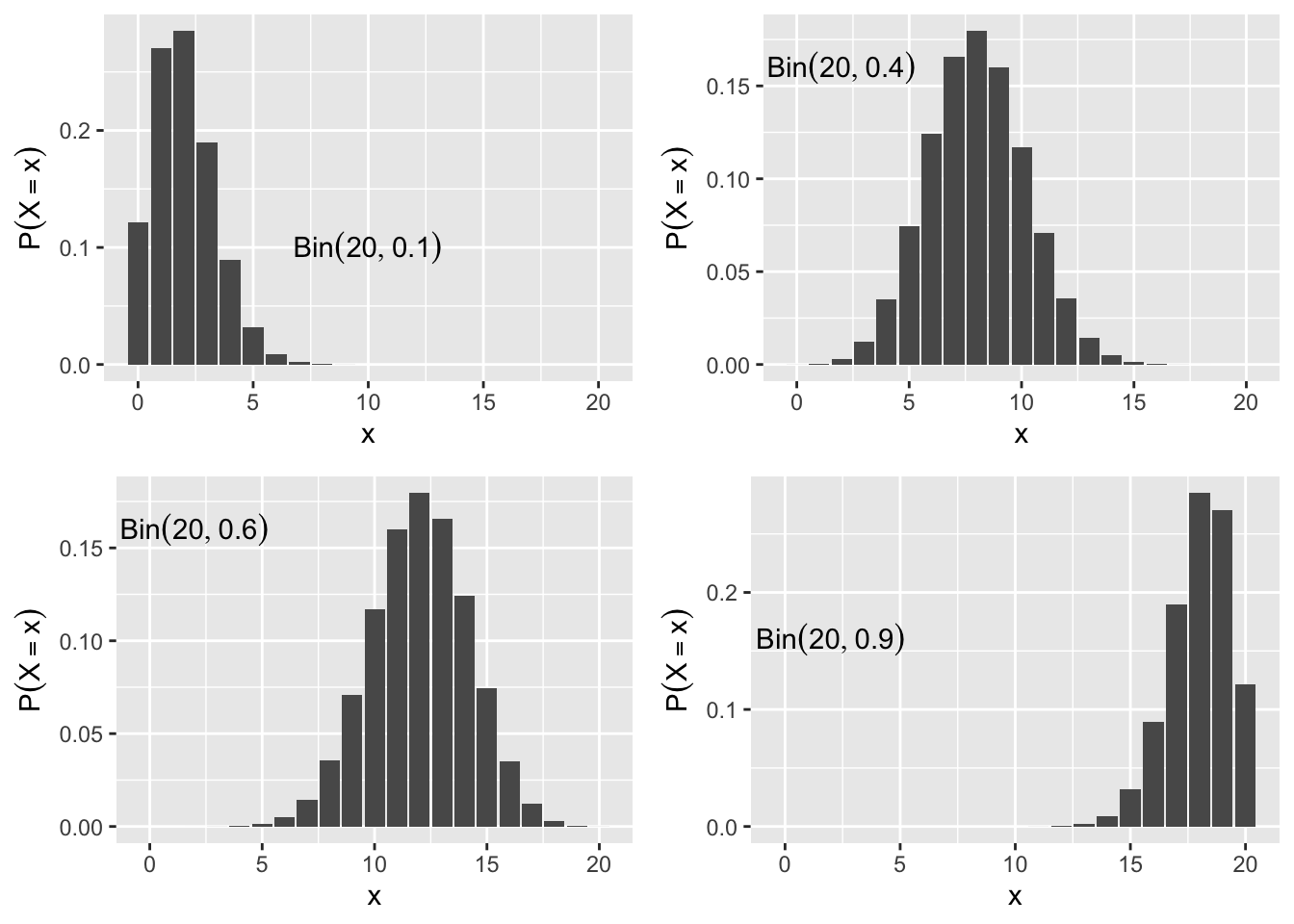
Figure 2.6: Binomial Probability Mass Function
2.4.2 The Normal Distribution
The density function of the normal distribution with mean \(\mu\) and standard deviation \(\sigma\) is
\[ \phi(x; \mu,\sigma)=\frac{1}{\sigma \sqrt{2\pi}}exp\left( \frac{-1}{2} \left(\frac{x-\mu}{\sigma}\right)^2\right)\]
The standard normal density is \(\phi(x)=\phi(x;0,1)\) (Figure 2.7). The mean shifts the normal density along the horizontal axis, and the standard deviation scales the curve along the vertical axis.
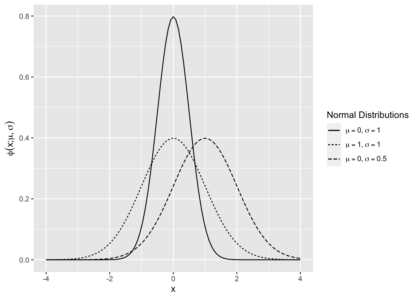
Figure 2.7: Normal Density Function
A random variable \(X\) that follows a normal distribution with mean \(E(X) = \mu\) and variance \(Var(X) =\sigma^2\) will be denoted by \(X \sim N\left(\mu, \sigma^2\right)\).
\(Y \sim N\left(\mu, \sigma^2\right)\) if and only if \(Y = \mu + \sigma Z\), where \(Z \sim N(0,1)\).
The cumulative distribution function (CDF) of the \(N(\mu,\sigma^2)\),
\[\Phi(x;\mu,\sigma^2)= P(X<x)= \int_{-\infty}^x \phi(u)du\]
is shown in 2.8 using the R function for the normal CDF pnorm() for various values of \(\mu\) and \(\sigma.\)
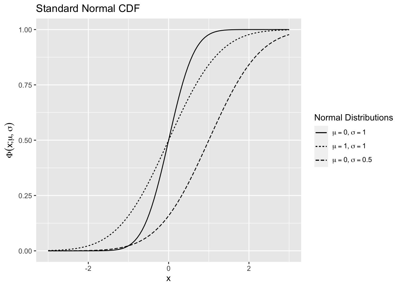
Figure 2.8: Normal Distribution Function
The CDF of the standard normal distribution will usually be denoted without \(\mu\) and \(\sigma^2\) as \(\Phi(x).\)
Definition 2.1 (Normal Quantile) The \(p^{th}, 0<p<1\) quantile of the \(N(0,1)\) is the value \(z_p\), such that \(\Phi(z_{p}) = p\).
The density function \(\phi\) of the \(N(\mu,\sigma^2)\) distribution is symmetric about its mean \(\mu\), \(\phi(\mu-x)=\phi(\mu+x)\).
Corollary 2.1 (Normal Quantile Symmetry) \(z_{1-p}=-z_{p}, \thinspace 0<p<1\)
Corollary 2.1 can be proved by noticing that the symmetry of \(\phi\) implies that \(1-\Phi(\mu-x;\mu,\sigma^2)=\Phi(\mu+x;\mu,\sigma^2).\) Let \(\mu=0, \sigma^2=1\), and \(x=z_p\) so \(\Phi(z_p)+\Phi(-z_p)=1\). \(p=\Phi(z_p) \Rightarrow 1-p=\Phi(-z_p)\), but \(1-p=\Phi(z_{1-p})\). So, \(\Phi(-z_p)=\Phi(z_{1-p}) \Rightarrow z_{1-p}=-z_{p}\).
2.4.3 Chi-Square Distribution
Let \(X_1, X_2, ..., X_n\) be i.i.d. \(N(0,1)\). The distribution of
\[ Y= \sum_{i = 1}^{n}X_i^2,\]
has a chi-square distribution on \(n\) degrees of freedom or \(\chi^2_{n}\), denoted \(Y \sim \chi^2_{n}\). \(E(Y)=n\) and \(Var(Y)=2n\).
The chi-square distribution is a right-skewed distribution but becomes normal as the degrees of freedom increase. Figure 2.9 shows \(\chi^2_{50}\) density is very close to the \(N(50,100)\) density.
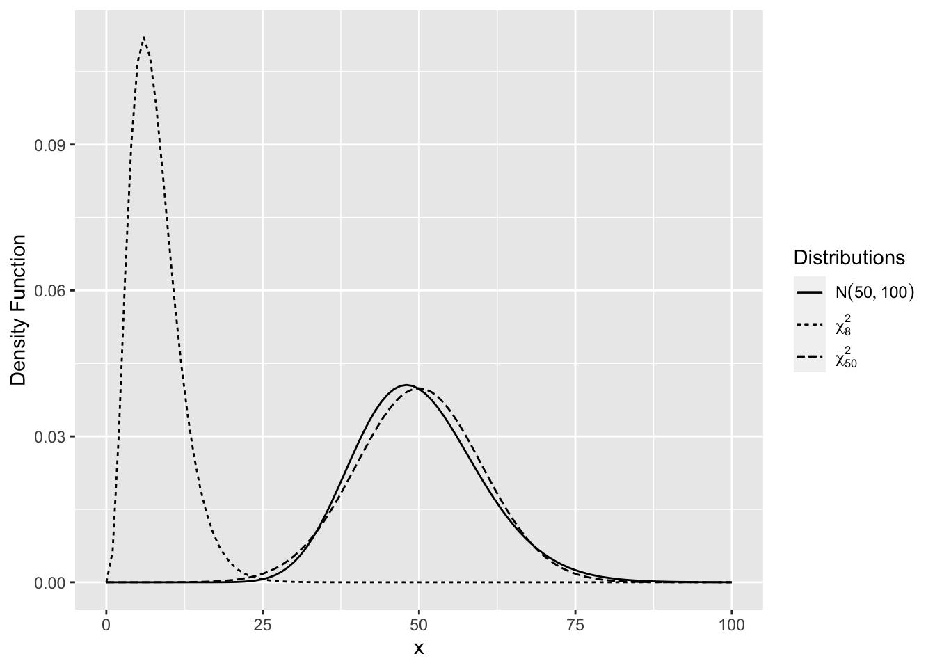
Figure 2.9: Comparison of Chi-Square Distributions
Let \(X_1, X_2, ..., X_n\) be i.i.d. \(N(0,1)\). The sample variance is \(S^2=\sum_{i=1}^n\left(X_i-\bar X\right)^2/(n-1)\). The distribution of \(\left(\frac{n-1}{\sigma^2}\right) S^2 \sim \chi^2_{n-1}\).
2.4.4 t Distribution
Let \(X \sim N(0,1)\) and \(W \sim \chi^2_n\) be independent. The distribution of \(\frac{X}{\sqrt{W/n}}\) has a t distribution on \(n\) degrees of freedom or \(\frac{X}{\sqrt{W/{n}}} \sim t_n\).
Let \(X_1, X_2, ..., X_n\) be i.i.d. \(N(0,1)\). The distribution of \(\sqrt n\left({\bar X}-\mu\right)/S \sim t_{n-1}\), where \(S^2\) is the sample variance and \(\bar X = n^{-1}\sum_{i=1}^nX_i\). This follows since \(\bar X\) and \(S^2\) are independent.
The t distribution for small values of \(n\) has “heavier tails” compared to the normal. As the degrees of freedom increase the t-distribution is almost identical to the normal distribution.
Figure 2.10 shows the density for various degrees of freedom. As the degrees of freedom becomes larger, the distribution is closer to the normal distribution, and for smaller degrees of freedom there is more probability in the tails of the distribution.
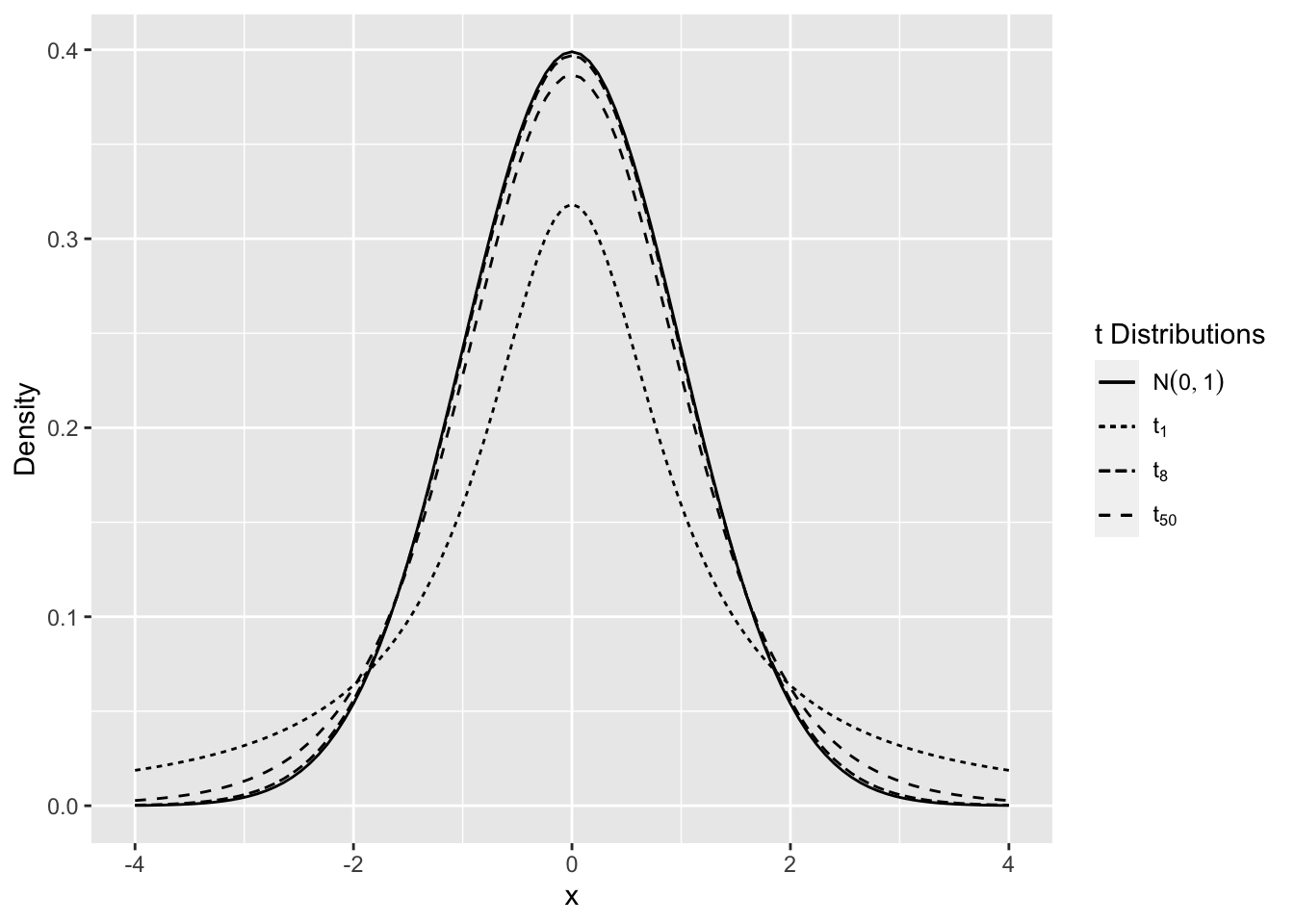
Figure 2.10: Comparison of t Distributions
2.4.5 F Distribution
Let \(X \sim \chi^2_m\) and \(Y\sim \chi^2_n\) be independent. The distribution of
\[ W= \frac{X/m}{Y/n} \sim F_{m,n},\]
has an F distribution on \(m,n\) degrees of freedom, denoted \(F_{m,n}\). The F distribution is a right skewed distribution (see Figure 2.11).
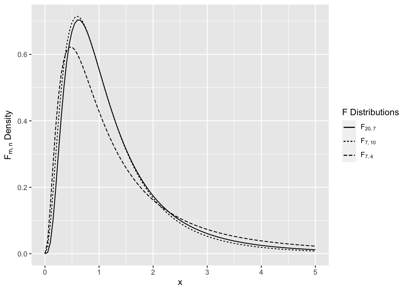
Figure 2.11: Comparison of F Distributions
2.4.6 Computation Lab: Theoretical Distributions
2.4.6.1 Binomial Distribution
In R a list of all the common distributions can be obtained by the command help("distributions").
Example 2.6 Use R to calculate the \(P(4 \le X<7)\) and \(P(X > 8)\) where \(X \sim Bin(10,0.2)\).
\(P(4 \le X<7) = P(X \le 6) - P(X \le 4) = F(6) - F(4),\) where \(F(\cdot)\) is the CDF of the binomial distribution. pbinom() can be used to calculate this probability.
2.4.6.2 Normal Distribution
Example 2.7 Use R to calculate \(P(X>5)\), where \(X \sim N(6,2)\).
\(P(X>5)=1-P(X<5)\). pnorm() can be used to calculate this probability.
Example 2.8 Use R to show that \(-z_{0.975}=z_{1-0.975}\).
qnorm() can be used to calculate \(z_{0.975}\), and \(z_{1-0.975}\).
2.4.6.3 Chi-Square Distribution
Example 2.9 If \(X_1,X_2,...,X_{50}\) are a random sample from a \(N(40,25)\) then calculate \(P(S^2>27)\).
We know that \(\frac{(50-1)}{25} S^2 \sim \chi^2_{(50-1)}\). So
\[\begin{aligned} P\left(S^2>27\right) &= P\left(\frac{49}{25}S^2>\frac{49}{25} \times 27\right) \\ &=P\left(\chi^2_{49}>52.92\right). \end{aligned}\]
The CDF of the \(\chi^2_{n}\), \(P(\chi^2_{n}<q)\) in R is pchisq().
1 - pchisq(q = 52.92,df = 49)
#> [1] 0.3253
So, \(P(S^2>27)=1-P(\chi^2_{49}<52.92)=\) 0.3253.
2.4.6.4 t Distribution
Example 2.10 A random sample of body weights (kg) from 10 male subjects are 66.9, 70.9, 65.8, 78.0, 71.6, 65.9, 72.4, 73.7, 72.9, and 68.5. The distribution of weight in this population is known to be normally distributed with mean 70kg. What is the probability that the sample mean weight is between 68kg and 71kg?
The distribution of \(\sqrt{10}\left({\bar X}-70\right)/S \sim t_9\), where \(S\) is the sample standard deviation. The sample standard deviation can be calculated using R:
weight_data <- c(66.9, 70.9, 65.8, 78.0, 71.6,
                 65.9, 72.4, 73.7, 72.9, 68.5)
sd(weight_data)
[1] 3.904
So
\[P\left(68 < {\bar X} < 71\right) = P\left(\frac{68-70}{3.904/\sqrt{10}} < \frac{{\bar X}-70}{3.904/\sqrt{10}} < \frac{71-70}{3.904/\sqrt{10}}\right).\]
Use pt() the CDF of the \(t_n\) distribution in R to calculate the probability.
low_lim <- (68-70)/(sd(weight_data)/sqrt(10))
up_lim <- (71-70)/ (sd(weight_data)/sqrt(10))
pt(up_lim, df = 9) - pt(low_lim, df = 9)
[1] 0.7107
\(P\left(68 < {\bar X} < 71\right) = P\left(-1.62<t_9<0.81\right) =\) 0.7107.
2.4.6.5 F Distribution
Example 2.11 Consider Example 2.10. Another random sample of 20 subjects from the same population is obtained. Let \(S^2_1\) be the sample variance of the first sample and \(S^2_2\) be the sample variance of the second sample. Use R to find the probability that the ratio of the second sample variance to the first sample variance exceeds 5.
We are asked to calculate \(P\left(S^2_2/S^2_1>5\right)\). The first and second samples are independent since we are told it’s a separate sample from the same population, and the distribution of weights in this sample will also be \(N(70,\sigma^2)\). Now, we know that \((20-1)/\sigma^2S^2_2 \sim \chi^2_{(20-1)} \Rightarrow S^2_2/\sigma^2 \sim \chi^2_{19}/19\), and \((10-1)/\sigma^2S^2_1 \sim \chi^2_{(10-1)} \Rightarrow S^2_1/\sigma^2 \sim \chi^2_{9}/9\).
\[\begin{aligned} P\left(S^2_2/S^2_1>5\right) &= P\left((S^2_2/\sigma^2)/(S^2_1/\sigma^2)>5\right) \\ &= P\left(((\chi^2_{19}/19)/(\chi^2_{9}/9) > 5\right) \\ &= P\left(F_{19,9} > 5\right) \end{aligned}\]
Use pf() the CDF of the \(F_{df_1,df_2}\) distribution in R to calculate the probability.
1- pf(q = 5, df1 = 19, df2 = 9)
#> [1] 0.008872
\(P\left(S^2_2/S^2_1>5\right)=\) 0.0089. It’s unlikely that the sample variance of another sample from the same population would be five times the variance of the first sample.
2.5 Quantile-Quantile Plots
Quantile-quantile (Q-Q) plots are useful for comparing distribution functions. If \(X\) is a continuous random variable with strictly increasing distribution function \(F(x)\) then the \(pth\) quantile of the distribution is the value \(x_p\) such that,
\[F(x_p)=p \mbox{ or } x_p = F^{-1}(p).\]
In a Q-Q plot, the quantiles of one distribution are plotted against another the quantiles of another distribution. Q-Q plots can be used to investigate whether a set of numbers follows a certain distribution.
Consider independent observations \(X_1,X_2, ...,X_n\) from a uniform distribution on \([0,1]\) or \(\text{Unif}[0,1]\). The ordered sample values (also called the order statistics) are the values \(X_{(j)}\) such that \(X_{(1)}<X_{(2)}< \cdots < X_{(n)}\).
It can be shown that \(E\left(X_{(j)}\right)=\frac{j}{n+1}.\) This suggests that if the underlying distribution is Unif[0,1] then a plot of \(X_{(j)}\) vs. \(\frac{j}{n+1}\) should be roughly linear.
Figure 2.12 shows two random samples of 1,000 from \(\text{Unif}[0,1]\) and \(N(0,1)\) plotted against their order, \(j/(n+1)\), with a straight line to help assess linearity. The points from the \(\text{Unif}[0,1]\) follow the reference line, while the points from the \(N(0,1)\) systematically deviate from this line.
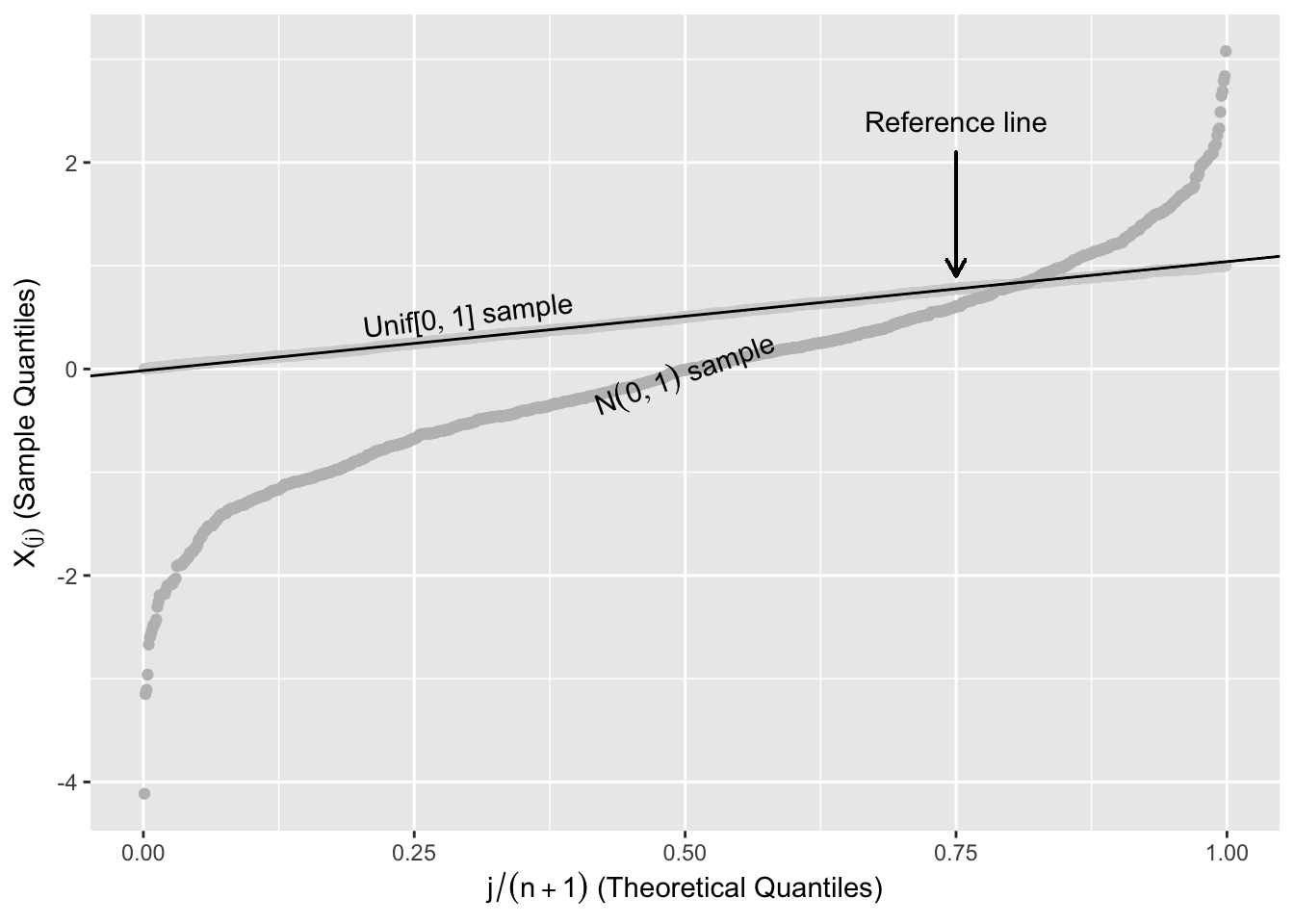
Figure 2.12: Expected Uniform Order Statistics
The reference line in Figure 2.12 is a line that connects the first and third quartiles of the \(\text{Unif}[0,1]\). Let \(x_{25}\) and \(x_{75}\) be the first and third quartiles of the uniform distribution, and \(y_{75}\) and \(y_{25}\) be the first and third quartiles of the ordered sample. The reference line in Figure 2.12 is the straight line that passes through \((x_{25},y_{25})\) and \((x_{75},y_{75})\).
A continuous random variable with strictly increasing CDF \(F_X\) can be transformed to a \(\text{Unif}[0,1]\) by defining a new random variable \(Y = F_X(X)\). This transformation is called the probability integral transformation.
This suggests the following procedure. Suppose that it’s hypothesized that a sample \(X_1,X_2,...,X_n\) follows a certain distribution, with CDF \(F\). We can plot \(F(X_{(j)}) \hspace{0.2cm} {\text{vs. }} \hspace{0.2cm} \frac{j}{n+1}\), or equivalently
\[\begin{equation} X_{(j)} \hspace{0.2cm} {\text{vs. }} \hspace{0.2cm} F^{-1}\left(\frac{j}{n+1}\right) \tag{2.1} \end{equation}\]
\(X_{(j)}\) can be thought of as empirical quantiles and \(F^{-1}\left(\frac{j}{n+1}\right)\) as the hypothesized quantiles.
There are several reasonable choices for assigning a quantile to \(X_{(j)}\). Instead of assigning it \(\frac{j}{n+1}\), it is often assigned \(\frac{j-0.5}{n}\). In practice it makes little difference which definition is used.
Figure 2.13 shows two ordered random samples of 1000 from the \(\text{Unif}[0,1]\) and \(N(0,1)\) plotted against \(\Phi^{-1}\left(k/(n+1)\right)\) (see (2.1)). The points from the \(\text{Unif}[0,1]\) systematically deviate from the reference line.
2.5.1 Computation Lab: Quantile-Quantile Plots
The R code below can be used to produce a plot similar to Figure 2.13, but without annotations and transparency to show the different samples. \(\Phi^{-1}(x)\) can be computed using qnorm(). rnorm() and runif() simulate random numbers from the normal and uniform distributions, and geom_abline(slope = b, intercept = a) adds the line y=a+bx to the plot.
n <- 1000
y <- sort(rnorm(1000))
q <- quantile(y, c(0.25,0.75))
slope <- (q[2]-q[1])/(qnorm(.75)-qnorm(.25))
int <- q[1]-slope*qnorm(.25)

tibble(y = sort(rnorm(n)), x = qnorm(1:n/(n+1))) %>%
  ggplot(aes(x,y)) + geom_point() +
  geom_point(data = tibble(y = sort(runif(n)),
                           x = qnorm(1:n/(n+1)))) +
  geom_abline(slope = slope, intercept = int)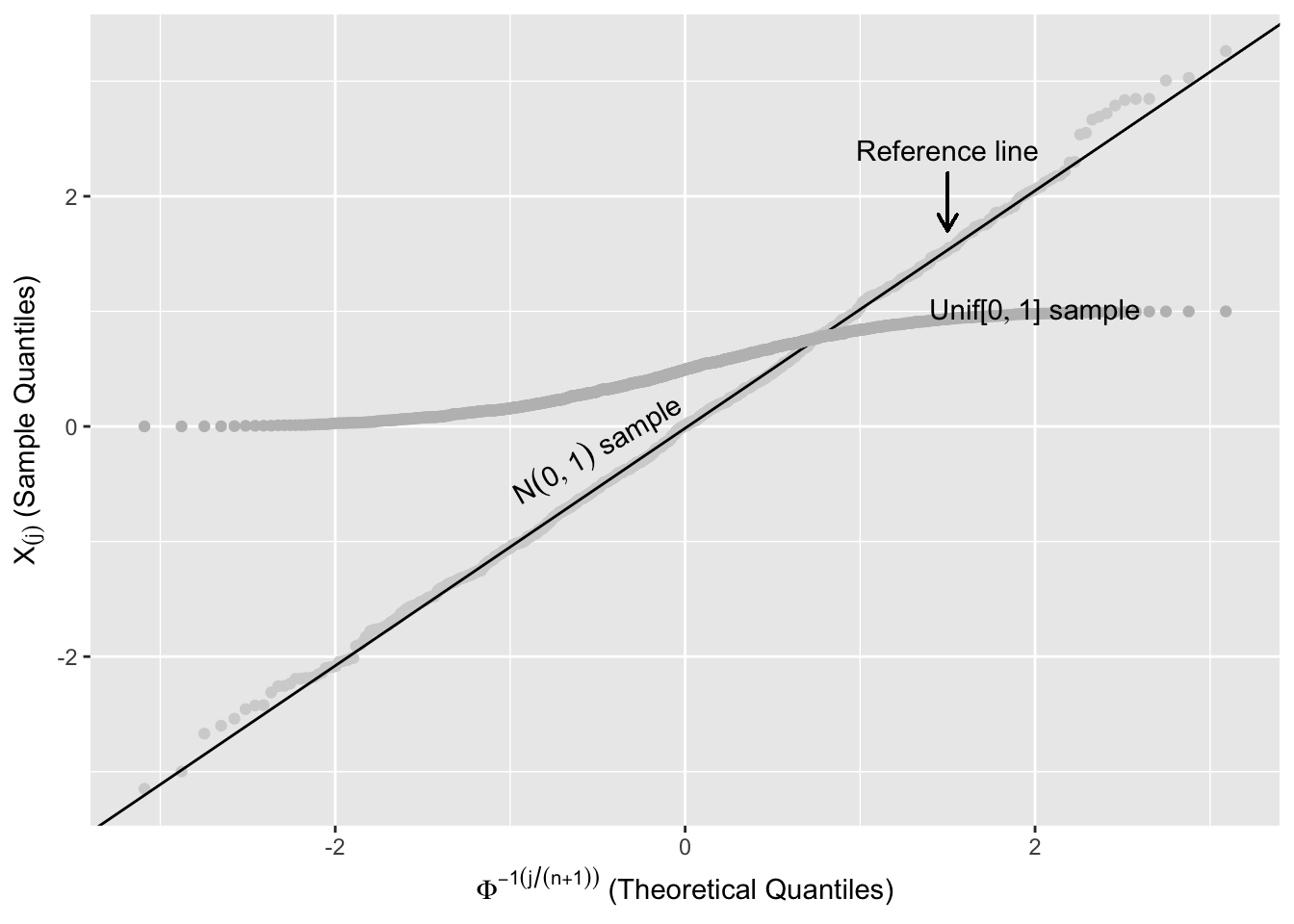
Figure 2.13: Comparing Sample Quantiles with Normal Distribution
Quantile-quantile plots are implemented in many graphics libraries including ggplot2. geom_qq() produces a plot of the sample versus the theoretical quantiles, and geom_qq_line() adds a reference line to assess if the points follow a linear pattern. The default distribution in geom_qq() and geom_qq_line() is the standard normal, but it’s possible to specify another distribution using the distribution and dparms parameters.
Figure 2.14 shows the Q-Q plots comparing a simulated sample from a \(\chi^2_8\) to a \(N(0,1)\) (left plot) and, the correct, \(\chi^2_8\) (right plot).
set.seed(27)
y <- rchisq(n = 1000, df = 8)

p1 <- tibble(y) %>%
  ggplot(aes(sample = y)) +
  geom_qq() +
  geom_qq_line() +
  ylab("Sample Quantiles") +
  xlab("Theoretical Quantiles")

p2 <- tibble(y = y) %>%
  ggplot(aes(sample = y)) +
  geom_qq(distribution = qchisq, dparams = list(df = 8)) +
  geom_qq_line(distribution = qchisq, dparams = list(df = 8)) +
  ylab("Sample Quantiles") +
  xlab("Theoretical Quantiles")

p1 + p2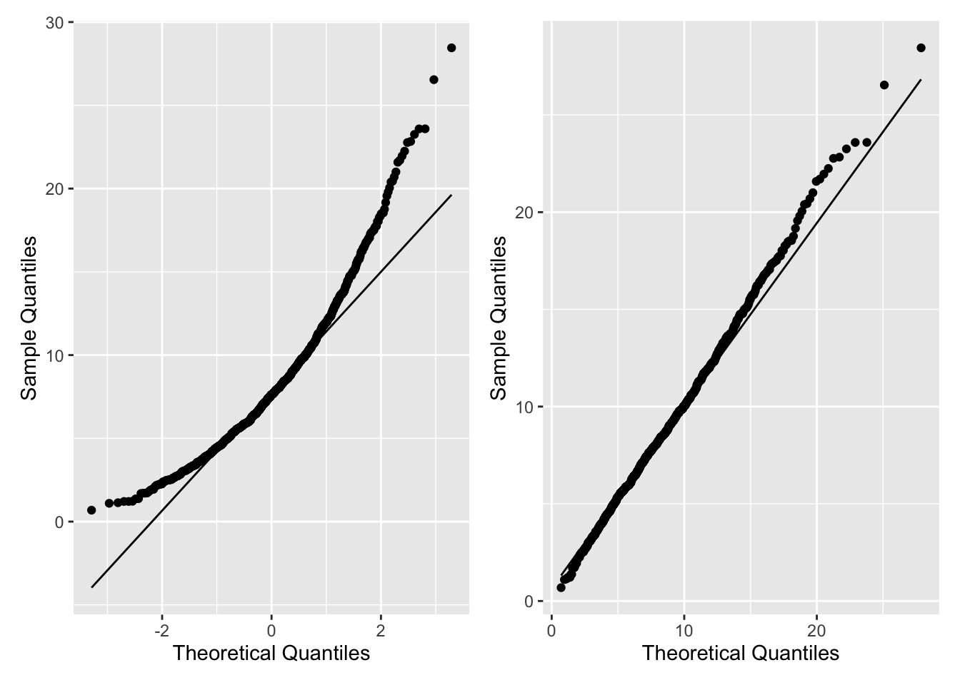
Figure 2.14: Q-Q Plots using geom_qq()
Example 2.12 agedat contains the ages of participants in a study of social media habits. Is it plausible to assume that the data are normally distributed?
A summary of the distribution is
agedata %>%
  summarise(N = n(),
            Mean = mean(age),
            Median = median(age),
            SD = sd(age),
            IQR = IQR(age))
# A tibble: 1 × 5
      N  Mean Median    SD   IQR
  <int> <dbl>  <dbl> <dbl> <dbl>
1    50  36.7     35  6.88  2.75
The mean and median are very close, but the standard deviation is much larger than the IQR, and the left panel of Figure 2.15 shows the distribution of age is symmetric.
Neither the distribution summary nor the left panel of Figure 2.15 allows us to evaluate whether the data is normally distributed.
If the data has a normal distribution, then it should be close to a \(N(37,49)\). A Q-Q plot to assess this is shown in the right panel of Figure 2.15.
p1 <- agedata %>% ggplot(aes(x = age)) +
  geom_histogram(bins = 10, colour = "black", fill = "grey") +
  ggtitle("Distribution of Age")

p2 <- agedata %>%
  ggplot(aes(sample = age)) +
  geom_qq(dparams = list(mean = 37, sd = 7)) +
  geom_qq_line(dparams = list(mean = 37, sd = 7)) +
  ggtitle("Normal Quantile Plot of Age") +
  xlab("Theoretical Quantiles") +
  ylab("Sample Quantiles")

p1 + p2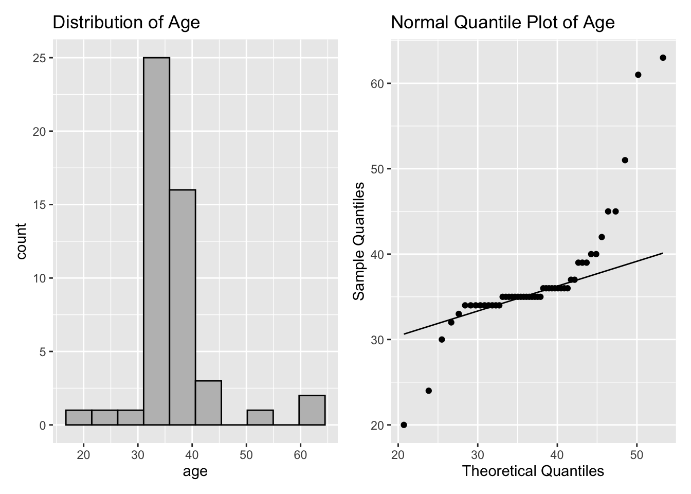
Figure 2.15: Age Plots
The histogram and the Q-Q plot indicate the tails of the age distribution are heavier than the normal distribution. The right panel of Figure 2.15 shows a systematic deviation from the reference line for very small and large sample quantiles, which implies that the data are not normally distributed.
2.6 Central Limit Theorem
Theorem 2.1 (Central limit theorem) Let \(X_1, X_2, ...\) be an i.i.d. sequence of random variables with mean \(\mu = E(X_i)\) and variance \(\sigma^2 = Var(X_i)\).
\[ \lim_{n\to\infty} P\left(\frac{\bar X - \mu}{\frac {\sigma}{\sqrt n}} \leq x \right) = \Phi(x),\] where \({\bar X} = \sum_{i = 1}^{n} X_i/n\).
The central limit theorem states that the distribution of \({\bar X}\) is approximately \(N\left(\mu,\sigma^2/n\right)\) for large enough \(n\), provided the \(X_i\)’s have finite mean and variance.
2.6.1 Computation Lab: Central Limit Theorem
Example 2.13 Seven teaching hospitals affiliated with the University of Toronto delivered 33,481 babies between July 1, 2019 and June 31, 2020.22 What is the distribution of the average number of female births at University of Toronto teaching hospitals?
Let \(X_i = 1\), if a baby is born female, and \(X_i = 0\) if the baby is male, \(i = 1,...,33481\). The probability of a female birth is 0.5, \(P(X_i = 1)=0.5\), and \(X_i \sim Bin(1, 0.5)\).
The average number of females is \(\bar X = \sum_{i = 1}^{33481} X_i/33481\). \(E(X_i)=0.5\) and \(Var(X_i)=p(1-p)=0.5(1-0.5)=0.25\).
\[\frac{\sqrt{33481} \left(\bar X - 0.5\right)}{0.25} \overset{approx}\sim N(0,1).\] This is known as the sampling distribution of \(\bar X\).
A simulation of size 100 (N <- 100) from the sampling distribution of \(\bar X\), with \(X_i \sim Bin(n,p)\), where \(n=1, p=0.5\) is implemented below. Each simulated data set has 33,481 rows (M <- 33481) representing a hypothetical data set of births for the year. sprintf("SIM%d",1:N) renames the columns of sims to SIM1, SIM2,…,SIM100.
set.seed(28)
N <- 100
M <- 33481
n <- 1
p <- 0.5
sims <- replicate(N, rbinom(M, n, p))
colnames(sims) <- sprintf("SIM%d", 1:N)
female_babies <- as_tibble(sims)

head(female_babies, n = 3)
#> # A tibble: 3 × 100
#>    SIM1  SIM2  SIM3  SIM4  SIM5  SIM6  SIM7  SIM8  SIM9
#>   <int> <int> <int> <int> <int> <int> <int> <int> <int>
#> 1     0     1     1     0     0     0     0     0     0
#> 2     0     1     1     1     1     0     0     1     1
#> 3     0     0     0     0     0     0     1     0     0
#> # … with 91 more variables: SIM10 <int>, SIM11 <int>,
#> #   SIM12 <int>, SIM13 <int>, SIM14 <int>,
#> #   SIM15 <int>, SIM16 <int>, SIM17 <int>,
#> #   SIM18 <int>, SIM19 <int>, SIM20 <int>,
#> #   SIM21 <int>, SIM22 <int>, SIM23 <int>,
#> #   SIM24 <int>, SIM25 <int>, SIM26 <int>,
#> #   SIM27 <int>, SIM28 <int>, SIM29 <int>, …
The R code to generate Figure 2.16 is shown below.
female_babies %>%
  summarise(across(all_of(colnames(female_babies)), mean)) %>%
  pivot_longer(
    cols = colnames(female_babies),
    names_to = "sim",
    values_to = "mean"
  ) %>%
  ggplot(aes(sample = mean)) +
  geom_qq() +
  geom_qq_line()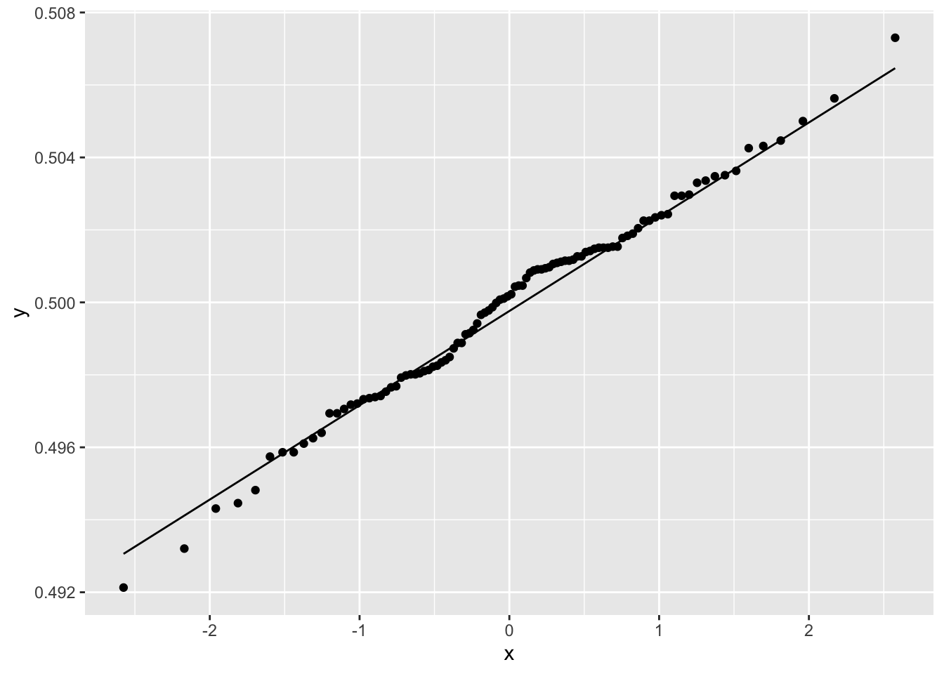
Figure 2.16: Normal Quantile Plot of Average Number of Female Babies
The figure shows that the distribution of average number of females born is normally distributed. The mean of each column was computed using across() giving a data frame with one row and one hundred columns. ggplot() requires that the data be shaped so that the columns correspond to the variables that are to be plotted, and the rows represent the observations. tidyr::pivot_longer() function reshapes the data into this format: The names_to parameter names the new column sim where the values of the rows will be SIM1 to SIM100; values_to parameter will create a column mean where each row contains the mean value of a simulation.
2.7 Statistical Inference
2.7.1 Hypothesis Testing
The hypothesis testing framework is a method to infer plausible parameter values from a data set.
Example 2.14 Let’s continue with Example 2.13. Investigators want to compare the Caesarean section (C-section) rate between Michael Garrison Hospital (MG) and North York General Hospital (NYG). Table 2.6 summarises the data. Is the C-section rate in the two hospitals statistically different?
| Hospital | Total Births | C-Section Rate |
|---|---|---|
| MG | 2840 | 29% |
| NYG | 4939 | 32% |
The observed difference in the proportions of C-section rates is calculated as the difference between \(\hat p_{MG},\) and \(\hat p_{NYG}\)—the proportion of C-sections at MG and NYG: \(\hat p_{MG} - \hat p_{NYG}=\) -0.03.
2.7.2 Hypothesis Testing via Simulation
How likely are we to observe a difference of this or greater magnitude, if the proportions of C-sections in the two hospitals are equal? If it’s unlikely, then this is evidence that either (1) the assumption that the proportions are equal is false or (2) a rare event has occurred.
Assume that MG has 2840 births per year, and NYG has 4939 births per year, but the probability of a C-section at both hospitals is the same. The latter statement will correspond to the hypothesis of no difference or the null hypothesis . The null hypothesis \(H_0\) can be formally stated as \(H_0:p_{MG}=p_{NYG}\), where \(p_{MG}\) and \(p_{NYG}\) are the probabilities of a C-section at MG and NYG.
If \(H_0:p_{MG}=p_{NYG}\) is true, then
A woman who gives birth at MG or NYG should have the same probability of a C-section.
If 2,840 of the 7,779 women are randomly selected and labeled as MG and the remaining 4,939 women are labeled as NYG then the proportions of C-sections \(\hat p^{(1)}_{MG}\) and \(\hat p^{(1)}_{NYG}\) should be almost identical or \(\hat p^{(1)}_{MG} - \hat p^{(1)}_{NYG} \approx 0.\)
If the random selection in 2. is repeated a large number of times, say \(N\), and the differences for the \(i^{th}\) random selection \(\hat p^{(i)}_{MG} - \hat p^{(i)}_{NYG}\) are calculated each time, then this will approximate the sampling distribution of \(\hat p_{MG} - \hat p_{NYG}\) (assuming \(H_0\) is true). \(\hat p^{(i)}_{MG}\) and \(\hat p^{(i)}_{NYG}\) are the proportions of C-sections in MG and NYG after the hospital labels
MGandNYGhave been randomly shuffled. In order to randomly shuffle the hospital labels we can randomly select 2,840 observations from the data set and label themMG, and label the remaining 7,779-2,840=4,939 observations asNYG. Remember if \(H_0\) is true, then it shouldn’t matter which 2,840 observations are labeled asMGand which 4,939 are labeled asNYG.
2.7.3 Model-based Hypothesis Testing
Another method to evaluate the question in Example 2.14 is to assume that the distribution of C-sections within each hospital follows a binomial distribution. If \(H_0\) is true, then the theoretical sampling distribution of \(\hat p_{MG} - \hat p_{NYG}\) is \(N(0,p(1-p)(1/2840+1/4939)),\) where \(p\) is the probability of a C-section. We can evaluate \(H_0\) by testing whether the mean of this normal distribution is zero. The null hypothesis does not specify a value of \(p\), but is usually estimated using the combined sample to estimate the proportion:
The normal deviate is
\[z = \frac{\hat p_{MG} - \hat p_{NYH}}{\sqrt{\hat p(1-\hat p)(1/n_1+1/n_2)}}=\frac{-0.03}{\sqrt{0.31(0.69)(1/2840+1/4939)}}=-2.75,\]
so, the p-value for a two-sided test is \(P(|Z|>|-2.75|)=2*\Phi(-2.75) = 0.01\)
2.7.4 Computation Lab: Hypothesis Testing
Now, let’s implement the simulation described in 2.7.2.
set.seed(9)

N <- 1000
samp_dist <- numeric(N)       # 1. output
for (i in seq_along(1:N)) {   # 2. sequence
  shuffle <- sample(x = 7779, size = 2840) # 3. body
  p_MG_shuffle <- sum(CSectdat$CSecthosp[shuffle]) / 2840
  p_NYG_shuffle <- sum(CSectdat$CSecthosp[-shuffle]) / 4939
  samp_dist[i] <- p_MG_shuffle - p_NYG_shuffle
}
This simulation code has three components:
output:
samp_dist <- numeric(N)allocates a numeric vector of sizeNto store the output.sequence:
i in seq_along(1:N)determines what to loop over: each iteration will assignito a different value from the sequence1:N.body:
shuffle <- sample(x = 7779, size = 2840)selects a random sample ofsize = 2840from the sequence1:7779and stores the result inshuffle,p_MG_shuffleandp_NYG_shuffleare the shuffled proportions of C-sections in the MG and NYG, andsamp_dist[i]stores the difference in shuffled proportions for the \(i^{th}\) random shuffle.
Figure 2.17 shows a histogram of the sampling distribution (also see Section 3.7) of the test statistic \(\hat\delta =\hat p_{MG}- \hat p_{NYG}\). The distribution is symmetric and centred around zero.
The R code for Figure 2.17 without annotations is shown below.
tibble(samp_dist) %>%
  ggplot(aes(samp_dist)) +
  geom_histogram(bins = 35,
                 colour = "black",
                 fill = "grey")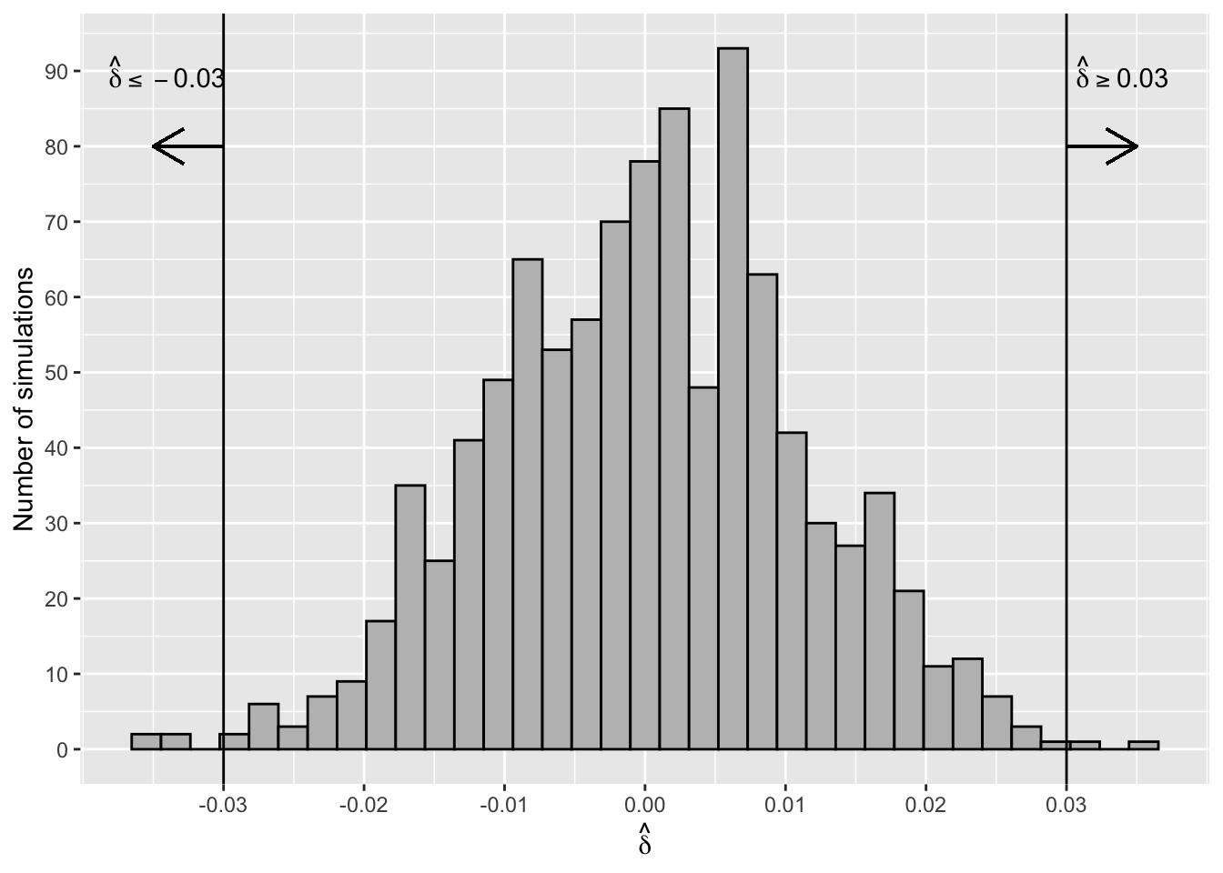
Figure 2.17: Sampling Distribution of Difference of Proportions
Figure 2.18 shows that the simulated sampling distribution is normally distributed even though there are no assumptions about the distribution of \(\hat \delta\).
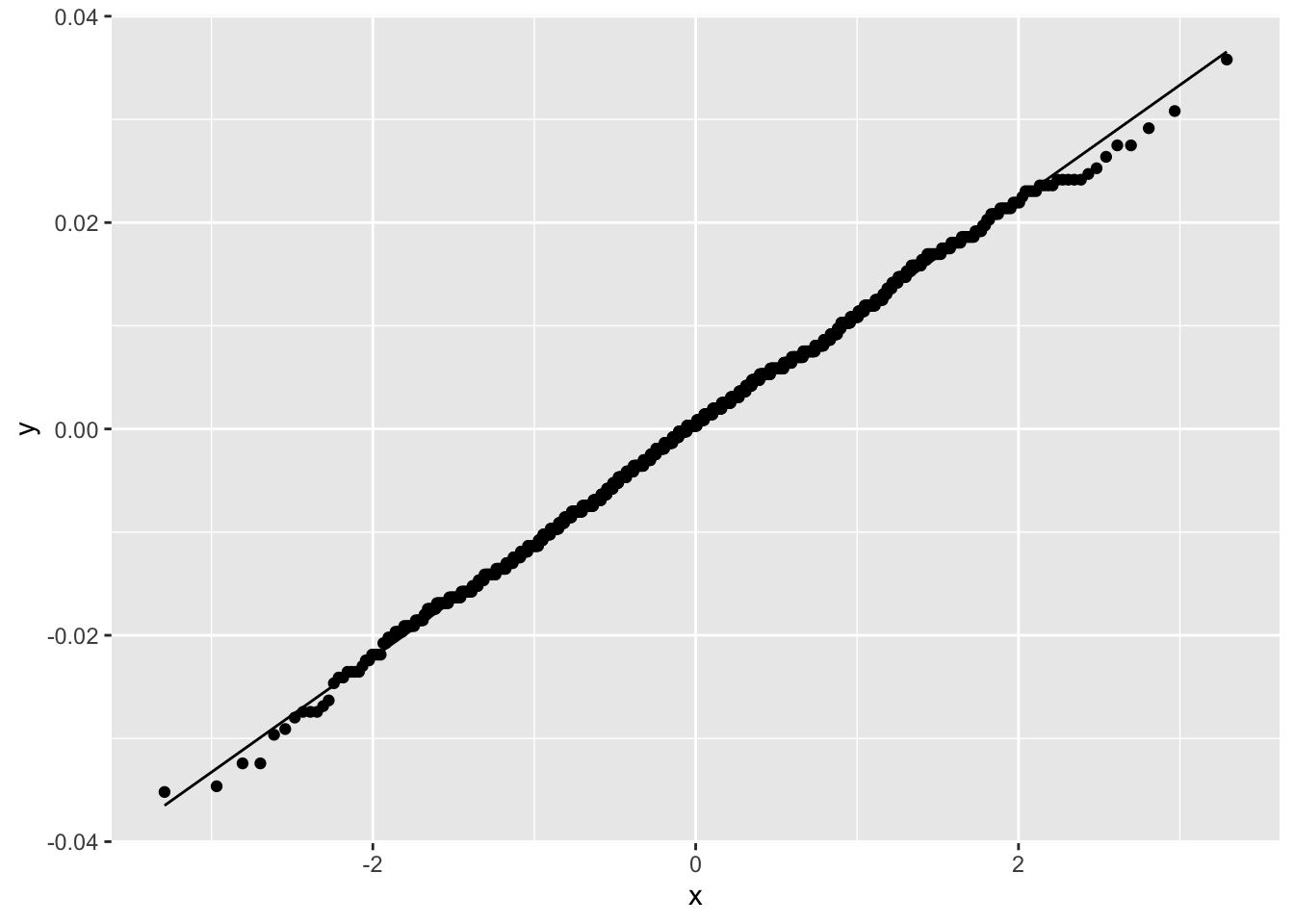
Figure 2.18: Normal Q-Q Plot for Sampling Distribution of Difference in C-Section Proportions
The proportion of simulated differences that are as extreme or more extreme (in either the positive or negative direction) than the observed difference of -0.03 is
p_value_sim <- sum(samp_dist >= abs(obs_diff) |
                     samp_dist <= -1*abs(obs_diff))/N
p_value_sim
#> [1] 0.006
p_value_sim is called the two-sided p-value of the test. Six of the 1000 simulations were as extreme or more extreme than the observed difference, assuming \(H_0\) is true (see Figure 2.17). This means that either a rare event (i.e., the event of observing a test statistic as extreme or more extreme than the observed value) has occurred or the assumption that \(H_0\) is true is not supported by the data. This test, or any other hypothesis tests, can never say definitively which is the case, but it’s common practice to interpret a p-value this small as weak evidence to support the assumption that \(H_0\) is true. In other words, there is strong evidence that C-section rates in the two hospitals are different.
Alternatively, we could use R to conduct a model-based hypothesis test comparing the proportions of C-sections in Example 2.14.
CSectdat %>% summarise(Births = n(),
                       Total = sum(CSecthosp),
                       Rate = Total/Births)
#> # A tibble: 1 × 3
#>   Births Total  Rate
#>    <int> <int> <dbl>
#> 1   7779  2376 0.305
stats::prop.test() can be used to calculate the p-value for a model-based hypothesis test.
two_prop_test <- prop.test(n = c(2840,4939), x = c(819,1557),
                           correct = F)
two_prop_test$p.value
#> [1] 0.01326
The p-values from the simulation and model-based tests both yield strong evidence that C-section rates in the two hospitals are different..
2.7.5 Confidence Intervals
Consider the mean \(\bar X\) of a sample \(X_1,\ldots,X_n\), where the \(X_i\) are i.i.d. with mean \(\mu\) and variance \(\sigma^2\). The central limit theorem tells us that the distribution of \(\bar X\) is approximately \(N(\mu,\sigma^2/n).\) This means that apart from a 5% chance
\[\mu - 1.96\sigma/\sqrt{n}< \bar X < \mu + 1.96\sigma/\sqrt{n}.\] The left-hand inequality is equivalent to \(\mu <\bar X + 1.96\sigma/\sqrt{n}\), and the right-hand inequality is the same as \(\mu >\bar X - 1.96\sigma/\sqrt{n}\). Together these two statements imply \(\bar X - 1.96\sigma/\sqrt{n}<\mu <\bar X + 1.96\sigma/\sqrt{n},\) apart from a 5% chance when the sample was drawn.
The uncertainty attached to a confidence interval for \(\mu\) comes from the variability in the sampling process. We don’t know if any particular interval contains \(\mu\) or not. In the long run (i.e., in repeated sampling), 95% of the intervals will include \(\mu\). For example, if the study was replicated one thousand times and a 95% confidence interval was calculated for each study, then fifty confidence intervals would not contain \(\mu\).
\[\bar X - (z_{1-\alpha/2})\sigma/\sqrt{n}<\mu <\bar X + (z_{1-\alpha/2})\sigma/\sqrt{n},\] is a \(100(1-\alpha)\%\) confidence interval for \(\mu\).
2.7.6 Computation Lab: Confidence Intervals
The simulation below illustrates the meaning behind “95% of intervals will include the true \(\mu\).” The simulation generates N data sets of size n from the \(N(0,1)\) distribution. If a confidence interval is calculated for each of the N data sets, then how many will contain the true \(\mu=0\)?
set.seed(25) # 1. Setup parameters
N <- 1000
n <- 50
alpha <- 0.05
confquant <- qnorm(p = 1- alpha/2)

covered <- logical(N) #2. Output

for (i in seq_along(1:N)){ # 3. Sequence
  normdat <- rnorm(n)      # 4. Body
  ci.low <- mean(normdat) - confquant*1/sqrt(n)
  ci.high <- mean(normdat) + confquant*1/sqrt(n)

  if (ci.low < 0 & ci.high > 0) {
    covered[i] <- TRUE
    } else {
      covered[i] <- FALSE
    }
  }
sum(covered)
#> [1] 947
947 of the 1000 simulations contain or cover the true mean, slightly less than 950 predicted by theory, but for practical purposes close enough to 950.
Setup parameters:
Nis the number of simulations;nis the sample size;alphais the (type I - see Section 2.7.7) error rate for the confidence interval; andconfquant <- qnorm(p = 1- alpha/2)is the normal quantile associated with the confidence interval.Output:
coveredis a logical vector that will store Boolean values to indicate if the confidence interval contains zero.Sequence:
i in seq_along(1:N)determines what to loop over: each iteration will assignito a different value from the sequence1:N.Body:
rnorm(n)generates a sample of sizenfrom the \(N(0,1)\);ci.lowandci.highcalculate the lower and upper limits of the confidence interval; if(ci.low < 0 & ci.high > 0)is true, then the \(i^{th}\) confidence interval contains zero andcovered[i]isTRUE; otherwise it’sFALSE.
2.7.7 Errors in Hypothesis Testing
In hypothesis testing there are two types of errors that can be made. They are called type I and type II errors.
\[\begin{array}{c|c|c} & H_0 \text{ true} & H_a \text{ true} \\ \hline \text {Accept } H_0 & \text {correct decision} & \text {type II error} \\ \hline \text {Reject } H_0 & \text {type I error} & \text {correct decision} \end{array}\]
The probabilities of type I and II errors are usually set as part of a study design.
\[ \alpha = P(\text{type I error}), \thinspace \beta = P(\text {type II error}).\]
If the p-value \(\le \alpha\), then the test is statistically significant at level \(\alpha\). The power of the test is \(1-\beta\), the probability of rejecting \(H_0\) when the alternative hypothesis \(H_1\) is true. A feasible way to control power is through sample size (see Chapter 4).
2.8 Linear Regression
2.8.1 Simple Linear Regression
Simple linear regression models the relationship between a quantitative variable, \(y\), as a linear function of a quantitative variable, \(x\).
Example 2.15 (World Happiness Report) The World Happiness Report23 collects data from the Gallup World Poll global survey that measures life satisfaction using a “Cantril Ladder” question: think of a ladder with the best possible life being a 10 and the worst possible life being a 0.
Figure 2.19 shows the relationship between life satisfaction and childhood mortality in 2017 after a logarithmic transformation.
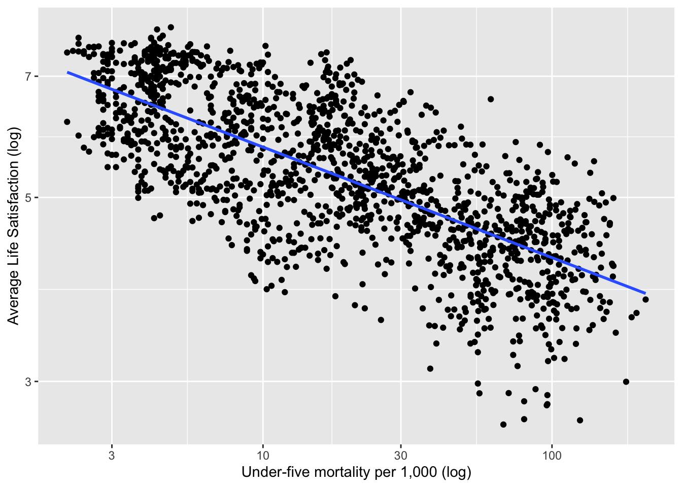
Figure 2.19: Life Satisfaction versus Child Mortality in 2017 (Example 2.15)
A simple linear regression model of life satisfaction versus childhood mortality is fit by estimating the intercept and slope in the equation:
\[\begin{equation} y_i = \beta_0 + \beta_1 x_i + \epsilon_i, i = 1,...,n \tag{2.2} \end{equation}\]
In this example, \(y_i\) and \(x_i\) are the \(i^{th}\) values of the logarithmic values of life satisfaction and childhood mortality.
Least-squares regression minimizes \(\sum_{i=1}^n\epsilon_i^2\) in (2.2). The values of \(\hat \beta_0\) and \(\hat \beta_1\) that minimize (2.2) are called the least squares estimators. \(\hat{\beta_0}={\bar y}-{\hat{\beta_1}}{\bar{x}}\), \({\hat{\beta_1}}=r\frac{S_y}{S_x},\) where \(r\) is the correlation between \(y\) and \(x\), and \(S_x\) and \(S_y\) are the sample standard deviations of \(x\) and \(y\) respectively.
The \(i^{th}\) predicted value is \(\hat y_i=\hat \beta_0+\hat \beta_1x_i\), and the \(i^{th}\) residual is \(e_i=y_i-\hat y_i\).
Least squares works well when the Gauss-Markov conditions hold in (2.2):
\(\ref{itm:firstcond}\) excludes data where a straight line is inappropriate; \(\ref{itm:seccond}\) avoids data where the variance is non-constant (this is often called heteroscedasticity); and \(\ref{itm:thirdcond}\) requires observations to be uncorrelated.
One popular measure of fit for simple linear regression models is
\[R^2= 1-\sum_{i=1}^ne_i^2/\sum_{i=1}^n(y_i-\bar y)^2.\]
\(R^2\) is the square of the correlation coefficient between \(y\) and \(x\), and has a useful interpretation as the proportion of variation that is explained by the linear regression of \(y\) on \(x\) for simple linear regression.
If \(\epsilon_i \sim N(0,\sigma^2)\), then \[y_i \sim N(\beta_0 + \beta_1 x_i,\sigma^2).\] It can be shown that
\[(\hat \beta_j - \beta_j)/se(\hat \beta_j) \sim t_{n-2},\]
for regression models with \(\beta_0 \ne 0.\) This can be used to form tests and confidence intervals for the \(\beta^{`s}.\)
2.8.2 Multiple Linear Regression
If there are \(k>1\) independent variables, then (2.2) can be extended to a multiple linear regression model.
\[\begin{equation} y_i=\beta_0+\beta_1 x_{i1} + \beta_2 x_{i2} + \cdots + \beta_k x_{ik} + \epsilon_{i}, \thinspace i = 1,...,n, \tag{2.3} \end{equation}\]
where \(Var(\epsilon_{i})= \sigma^2, \thinspace i = 1,...,n.\)
This can also be expressed in matrix notation as
\[\begin{equation} \underset{n \times 1}{\bf y} = \underset{n \times k}\thinspace X\underset{n \times 1}{\boldsymbol \beta}+\underset{n \times 1}{\boldsymbol \epsilon}. \tag{2.4} \end{equation}\]
The least squares estimator can then be expressed as
\[\begin{equation} {\hat {\boldsymbol \beta}}=\left(X^{\prime} X\right)^{-1}X^{\prime}{\bf y}, \tag{2.5} \end{equation}\]
and the covariance matrix of \({\hat \beta}\) is
\[\begin{equation} \mathrm{cov}\left(\hat{\beta} \right) = \left(X^{\prime} X\right)^{-1}{\sigma}^2. \tag{2.6} \end{equation}\]
An estimator of \(\sigma^2\) is \({\hat \sigma^2}=\frac{1}{n-k}\sum_{i = 1}^{n}(y_i-{\hat y_i})^2,\) where \({\hat y_i}={\hat \beta_0}+{\hat \beta_1} x_{i1} + \cdots + {\hat \beta_k} x_{ik}\) is the predicted value of \(y_i\).
2.8.3 Categorical Covariates in Regression
Covariates \(x_{ij}\) in (2.3) can either be continuous or categorical variables. If a categorical independent variable has \(k\) categories then \(k-1\) indicator variables should be used to index the categories provided the regression model contains a slope. If the regression model does not contain a slope, then exactly \(k\) indicator variables are required.
Investigators are interested in the relationship between Life Satisfaction and Region of the world in 2017 (Example 2.15). Figure 2.20 shows that satisfaction is highest in North America and lowest in Sub-Saharan Africa and South Asia. This relationship can be modelled using linear regression with a categorical covariate.
\[\begin{equation} y_{i} = \beta_0+\sum_{k=1}^6\beta_kx_{ik}+\epsilon_{i}, \tag{2.7} \end{equation}\]
where
\[x_{ik} = \left\{ \begin{array}{ll} 1 & \text{if Country } i \text{ belongs to Region } k \\ 0 & \text{Otherwise.} \end{array} \right.\]
In this case the covariate Region has seven unordered categories: East Asia & Pacific, Europe & Central Asia, Latin America & Caribbean, Middle East & North Africa, North America, South Asia, and Sub-Saharan Africa.
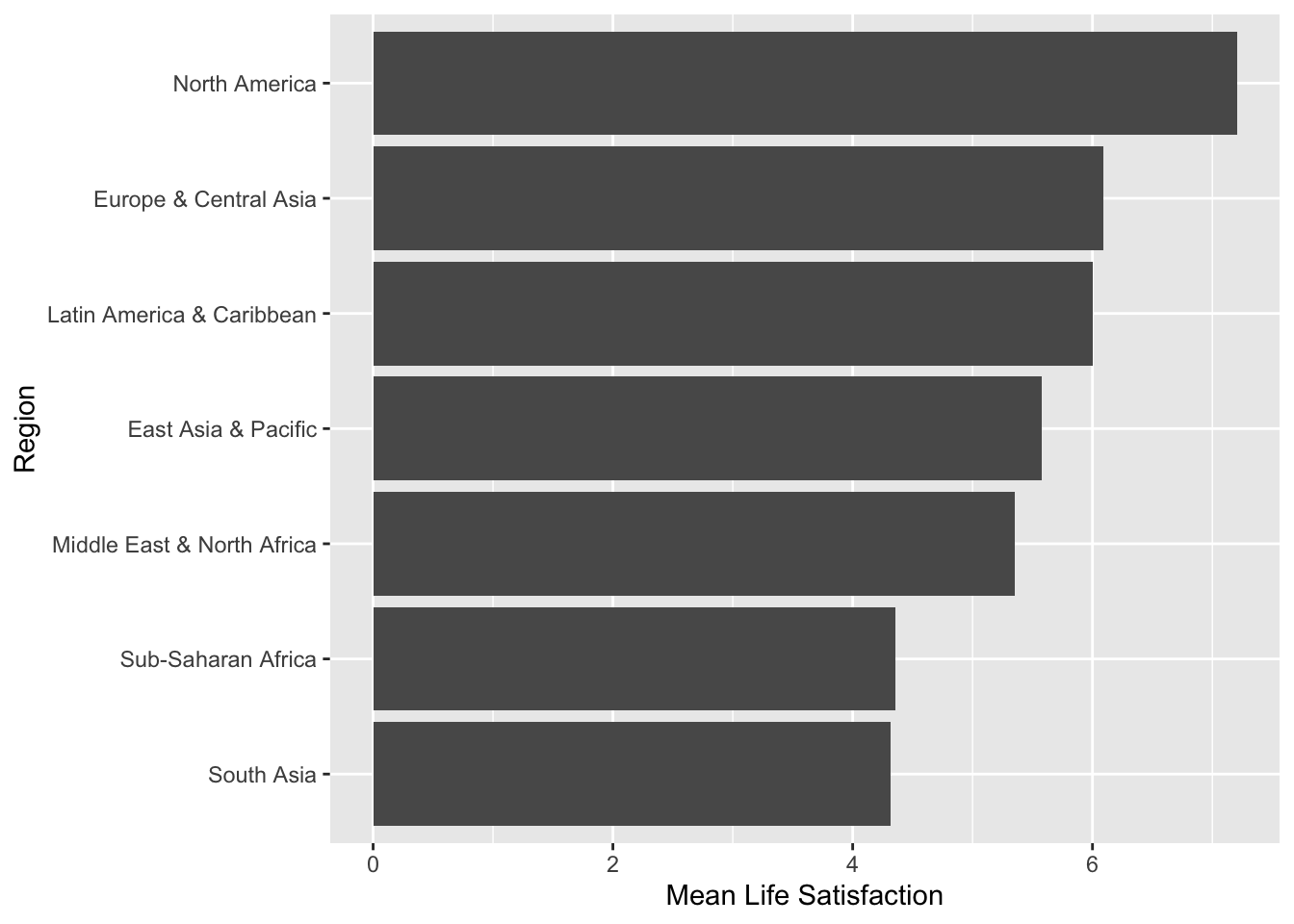
Figure 2.20: Mean Life Satisfaction by Region in 2017
\[E(y_{i}) = \beta_0+\sum_{k=1}^6\beta_kx_{ik}.\]
If \(k=1,\ldots,6\), then \(\mu_k = E(y_{i}) = \beta_0+\beta_{k}\), and if \(k=0\), then \(\mu_0 = E(y_{i}) = \beta_0\) then \(\beta_k = \mu_k - \mu_0.\) In this case \(\mu_0\) is the mean of the reference category. So, \(\beta_k, k=1,\dots,6\) is the mean difference between the \(k^{th}\) category and the reference category.
Example 2.16 (Hotelling's Weighing Problem) Harold Hotelling24 discussed how to obtain more accurate measurements through experimental design. A two-pan balance holds an object of unknown mass in one pan and an object of known mass in the other pan, and when the plates level off, the masses are equal, and if two objects are weighed in opposite pans, then the difference in mass is obtained.
An investigator measures the mass of two apples A and B using a two-pan balance scale (Figure 2.21). Two apples are weighed in one pan of the scale, and then in opposite pans. Let \(\sigma^2\) be the variance of an individual weighing. This scenario can be decsribed as two equations with the unknown weights \(w_1\) and \(w_2\) of the two apples.
\[\begin{align} \begin{split} w_1+w_2 &= m_1 \\ w_1-w_2 &= m_2. \end{split} \tag{2.8} \end{align}\]
Solving (2.8) for \(w_1,w_2\) leads to
\[\begin{align} \begin{split} {\hat w_1} &=(m_1+m_2)/2 \\ {\hat w_2} &=(m_1-m_2)/2. \end{split} \tag{2.9} \end{align}\]
So, \(Var\left({\hat w_1}\right)=Var\left({\hat w_2}\right)=\sigma^2/2.\) This is half the value when the objects are weighed separately.
The moral of the story is that the data collection process has a significant impact on the precision of estimates.
This can also be viewed as a linear regression problem.
\[\begin{align} \begin{split} w_1x_{11}+w_2x_{21} &= m_1 \\ w_1x_{21}-w_2x_{21} &= m_2, \end{split} \tag{2.10} \end{align}\]
where,
\[x_{ij} = \left\{ \begin{array}{ll} 1 & \mbox{if the } i^{th} \mbox{ measurement of the } j^{th} \mbox{ object is in the left pan} \\ -1 & \mbox{if the } i^{th} \mbox{ measurement of the } j^{th} \mbox{ object is in the right pan.} \end{array} \right.\]
(2.10) can be written in matrix form (2.4):
\[\begin{pmatrix} m_1 \\ m_2 \end{pmatrix} = \begin{pmatrix} 1 & 1 \\ 1 & -1 \\\end{pmatrix} \begin{pmatrix} w_1 \\ w_2 \end{pmatrix} + \begin{pmatrix} \epsilon_1 \\ \epsilon_2 \end{pmatrix}.\]
The least squares estimates are equal to (2.9).
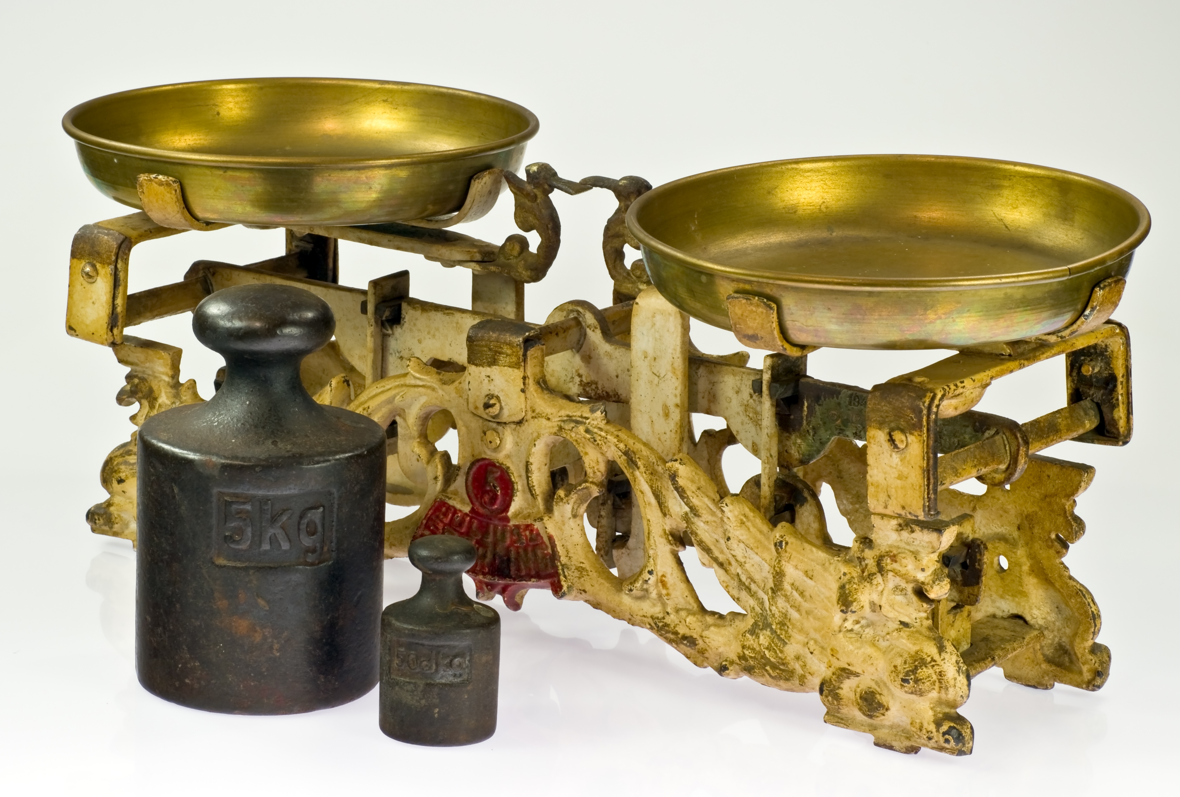
Figure 2.21: Pan Balance
2.8.4 Computation Lab: Linear Regression
2.8.4.1 Childhood Mortality
The World Bank25 records under 5 childhood mortality rate on a global scale. Under5mort and LifeSatisfaction contain data on under 5 childhood mortality (per 1,000) and life satisfaction between 2005 and 2017 across an average of 225 countries or areas of the world in the data frame lifesat_childmort.26
The regression model in 2.8.1 can be estimated using the lm() function in R.
lifemortreg <- lm(log10(LifeSatisfaction) ~ log10(Under5mort),
                  data = lifesat_childmort)

broom::tidy(lifemortreg)
broom::glance(lifemortreg)| term | estimate | std.error | statistic | p.value |
|---|---|---|---|---|
| (Intercept) | 0.8929 | 0.0044 | 204.00 | 0 |
| log10(Under5mort) | -0.1333 | 0.0032 | -41.28 | 0 |
| r.squared | adj.r.squared | sigma | statistic | p.value |
|---|---|---|---|---|
| 0.5279 | 0.5276 | 0.0637 | 1704 | 0 |
broom::tidy(lifemortreg) provides a summary the regression model (see Table 2.7). Each row summarizes the estimates and tests for \(\beta_j\): the first column term labels the regression coefficients; the second column estimate shows \(\hat \beta_j\); the third column std.error shows \(se(\beta_j)\), the fourth column statistic shows observed value of the \(t\) statistics for testing \(H_0:\beta_j=0\); and the last column p.value shows the corresponding p-value of the tests. For example, \(\hat \beta_0=\) 0.8929, and \(\hat \beta_1=\) 0.0044.
Table 2.8 shows the first five columns of broom::glance(lifemortreg)—a summary of the entire regression model. For example, \(R^2=\) 0.5279 and \(\hat \sigma^2=\) 0.0637.
The assumptions of constant variance and normality of residuals are investigated in Figure 2.22 for model (2.2).
p1 <- lifemortreg %>%
  ggplot(aes(.fitted, .resid)) +
  geom_point() +
  geom_hline(yintercept = 0)

p2 <- lifemortreg %>%
  ggplot(aes(sample = .resid)) +
  geom_qq() +
  geom_qq_line()

p1 + p2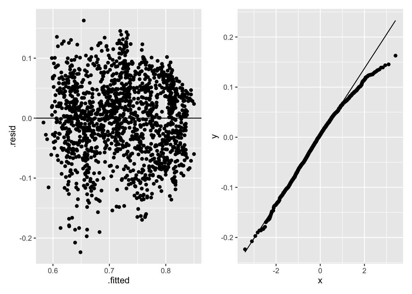
Figure 2.22: Regression Diagnostics for Life Satisfaction and Childhood Mortality
The left-hand panel in Figure 2.22 shows the residuals decreasing as the fitted values increase, indicating a non-constant variance; the right-hand panel in Figure 2.22 shows a normal Q-Q plot of the residuals that has a slightly heavier right-tail than the normal distribution. Heteroscedascity and lack of normality do not bias the least-squares estimates, but can increase the variances of the parameter estimates, so may affect \(R^2\) and hypothesis tests of the parameters.
R can be used to fit a multiple regression model of LifeSatisfaction on Region. lm() converts Region from a character type into a factor type with seven levels, which is then converted into six dummy variables. The code below fits a linear regression model that has six dummy variables and an intercept term using lm().
mod1 <- lm(LifeSatisfaction ~ Region,
           data = lifesat_childmort[lifesat_childmort$Year==2017,])
Table 2.9 shows the least least-squares estimates, where six estimates correspond to each region except East Asia & Pacific, which is used as the reference category. Each Coefficient \(\hat \beta_k\) is an estimate of \(\beta_k\) in (2.7) for the \(k^{th}\) region except the region used as the reference category (i.e., East Asia & Pacific). For example, \(\hat \beta_0=\) 5.5809, \(\hat \beta_1=\) 0.51, etc. How can we interpret these least squares estimates? Let’s compute the mean of LifeSatisfaction by year. The least squares estimate is the mean difference between Europe & Central Asia and East Asia & Pacific, which is equal to \(6.092-5.581=\) 0.511.
lifesat_childmort %>%
  filter(Year == 2017) %>%
  group_by(Region) %>%
  summarise(`Mean Life Satisfaction` =
              mean(LifeSatisfaction, na.rm = T))
#> # A tibble: 7 × 2
#>   Region                     `Mean Life Satisfaction`
#>   <chr>                                         <dbl>
#> 1 East Asia & Pacific                            5.58
#> 2 Europe & Central Asia                          6.09
#> 3 Latin America & Caribbean                      6.00
#> 4 Middle East & North Africa                     5.35
#> 5 North America                                  7.20
#> 6 South Asia                                     4.32
#> 7 Sub-Saharan Africa 4.35| term | estimate | std.error | statistic | p.value |
|---|---|---|---|---|
| (Intercept) | 5.5809 | 0.2252 | 24.7831 | 0.0000 |
| RegionEurope & Central Asia | 0.5114 | 0.2580 | 1.9824 | 0.0494 |
| RegionLatin America & Caribbean | 0.4213 | 0.2948 | 1.4289 | 0.1553 |
| RegionMiddle East & North Africa | -0.2311 | 0.3090 | -0.7479 | 0.4558 |
| RegionNorth America | 1.6225 | 0.6565 | 2.4713 | 0.0147 |
| RegionSouth Asia | -1.2615 | 0.4213 | -2.9944 | 0.0033 |
| RegionSub-Saharan Africa | -1.2276 | 0.2680 | -4.5802 | 0.0000 |
2.8.4.2 Hotelling’s Weighing Problem
We can find the least-squares estimates in Example 2.16 using R.
#step-by-step matrix multiplication for weighing problem
X <- matrix(c(1, 1, 1, -1), nrow = 2, ncol = 2) #define X matrix
Y <- t(X) %*% X #X'X
W <- solve(Y) #(X'X)^(-1)
W %*% t(X) #(X'X)^(-1)*X'
[,1] [,2]
[1,] 0.5 0.5
[2,] 0.5 -0.5W %*% t(X) can be used in (2.5) to find the least-squares estimators of the apple weights:
\((\hat w_1,\hat w_2)^{\prime} =\begin{pmatrix} 0.5 & 0.5 \\ 0.5 & -0.5 \end{pmatrix}(m_1,m_2)^{\prime}.\)
W
     [,1] [,2]
[1,]  0.5  0.0
[2,]  0.0  0.5
W can be used in (2.6) to find the variance of the least-squares estimators
\(\mathrm{cov}((\hat w_1,\hat w_2)^{\prime}) = \begin{pmatrix} 0.5 & 0.0 \\ 0.0 & 0.5 \end{pmatrix}\sigma^2.\)
It’s also possible to use lm() to compute the least-squares estimates.
2.9 Exercises
Exercise 2.1 Figure 2.3 displays the frequency distribution from Example 2.5. Create a similar plot using ggplot() to display the relative frequency distribution for each treatment group instead of the frequency distribution.
(Hint: geom_bar(aes(y = ..prop.., group = trt)) constructs bars with the relative frequency distribution for each trt group.)
Exercise 2.2 Reproduce Figure 2.4 using geom_histogram(aes(y = ..density..)) as shown below for Example 2.5. ggplot_build() extracts the computed values for the histogram. Use the extracted vales to confirm that the areas of all bars of the density histogram sum up to 1.
h <- covid19_trial %>%
  ggplot(aes(age)) +
  geom_histogram(
    aes(y = ..density..),
    binwidth = 2,
    color = 'black',
    fill = 'grey'
  )
densities <- ggplot_build(h)$data[[1]]
Exercise 2.3 In Section 2.3, 20 patients for Example 2.5 were randomly selected from a population of 25,000.
- Explain why the probability of choosing a random sample of 20 from 25,000 is
\[\frac{1}{{25000 \choose 20}}.\]
- Use R to randomly select 4 patients from a total of 8 patients, and calculate the probability of choosing this random sample.
Exercise 2.4 The treatment assignment displayed in Table 2.5 is from one treatment assignment out of \(20\choose10\) possible random treatment assignments.
R can be used to generate all possible combinations of 10 patients assigned to the treatment group using
combn(covid_sample$id, 10). Use the command to generate the combinations and confirm that there are \(20\choose10\) ways to generate the treatment assignments.To generate the random array of treatment assignments in Table 2.5, R was used to randomly select 10 patients for the active treatment first and then assigned the placebo to the remaining 10. We can also generate a random treatment assignment vector by randomly selecting a column from the matrix of all possible treatment assignments created in part a. In R, randomly select a column and assign the first 10 to the active treatment and the rest to the placebo. Repeat a few times and discuss whether the procedure results in random assignments as desired. (Hint: You can use
if_else(condition, true, false)insidemutateto returntruewhenconditionis met andfalseotherwise.)Another scheme we may consider is to assign
TRTorPLAto each patient with equal probabilities independently. Implement the procedure in R. Repeat a few times and discuss whether the procedure results in random assignments as desired.Can you think of another procedure in R for randomly assigning 10 patients to active treatment? Implement your own procedure in R to verify the procedure results in random assignments.
Exercise 2.5 Show that
\[P\left(a < X < b\right) = F(b)-F(a)\]
for a continuous random variable \(X\). Would this equality hold if \(X\) is a discrete random variable?
Exercise 2.6 In this exercise you will use R to compute the normal density and the cumulative distribution functions using dnorm and pnorm.
For any given values of
mu,sigma, andy, what value doesdnorm(y, mu, sigma)compute? Write the expression in terms of \(\mu\), \(\sigma\), and \(y\). How does the value compare to the value computed by1/sigma*dnorm((y-mu)/sigma)? Explain.For any given values of
mu,sigma, andy, what value doespnorm(y, mu, sigma)compute? Write the expression in terms of \(\mu\), \(\sigma\), and \(y\). How does the value compare to the value computed bypnorm((y-mu)/sigma)? Explain.
Exercise 2.7 Suppose \(X\sim N(0,1)\) and \(W_n\sim \chi_n^2\) independently for any positive integer \(n\). Let \(V_n=X\left/\sqrt{W_n}/n\right.\).
We know \(V_n\sim t_n\). Show that \(V_n^2\) follows an F distribution and specify the parameters.
Simulate 1,000 samples of \(V_1^2\), \(V_8^2\), and \(V_{50}^2\) using the
rtfunction in R and plot the histogram for each variable.Identify density functions of \(V_1^2\), \(V_8^2\), and \(V_{50}^2\) and use R to plot the theoretical density curves using
df()from the histograms from part b. for each variable. Is the shape of the density the exact same as the histogram? Explain.
Exercise 2.8 Explain why the reference line in Figure 2.12 uses the first and third quartiles from the \(Unif[0,1]\), and ordered sample.
Exercise 2.9 Recall that simulated squared values from Exercise 2.7 follow F distributions. Use geom_qq and geom_qq_line to plot Q-Q plots of the simulated squared values against the appropriate F distributions. Comment on the plot.
Exercise 2.10 We generated Figure 2.16 by first computing the mean values for each column and then pivoting the values into a single column of mean values. Replicate the data generation steps and use the replicated data to reproduce the plot by first pivoting the data into the long format with a column for the simulation numbers and a column for the values and, then computing the mean values for each simulation using group_by. Verify that the new plot is identical to Figure 2.16.
Exercise 2.11 A chemist has seven light objects to weigh on a balance pan scale. The standard deviation of each weighing is denoted by \(\sigma\). In a 1935 paper, Frank Yates27 suggested an improved technique by weighing all seven objects together, and also weighing them in groups of three. The groups are chosen so that each object is weighed four times altogether, twice with any other object and twice without it.
Let \(y_1,...,y_8\) be the readings from the scale so that the equations for determining the unknown weights, \(\beta_1,..., \beta_7\), are
\[\begin{aligned} y_1 &= \beta_1 + \beta_2 + \beta_3 + \beta_4 + \beta_5 + \beta_6 + \beta_7 + \epsilon_1 & \\ y_2 &= \beta_1 + \beta_2 + \beta_3 + \epsilon_2\\ y_3&= \beta_1 + \beta_4 + \beta_5 + \epsilon_3\\ y_4&= \beta_1 + \beta_6 + \beta_7 + \epsilon_4\\ y_5&= \beta_2 + \beta_4 + \beta_6 + \epsilon_5\\ y_6&= \beta_2 + \beta_5 + \beta_7 + \epsilon_6\\ y_7&= \beta_3 + \beta_4 + \beta_7 + \epsilon_7\\ y_8&= \beta_3 + \beta_5 + \beta_6 + \epsilon_8,\\ \end{aligned}\]
where the \(\epsilon_i, i = 1,...,8\) are independent errors.
Hotelling28 suggested modifying Yates’ procedure by placing in the other pan of the scale those of the objects not included in one of his weighings. In other words if the first three objects are to be weighed, then the remaining four objects would be placed in the opposite pan.
Write Yates’ procedure in matrix form and find the least squares estimates of \(\beta\).
Write Hotelling’s procedure in matrix form \({\bf y}=X{\bf \beta}+\epsilon\), where \({\bf y'}=(y_1,...,y_8)\), \({\bf \beta'}=(\beta_1,...,\beta_7)\), \({\bf \epsilon'}=(\epsilon_1,...,\epsilon_8)\), and \(X\) is an \(8\times7\) matrix. Find the least squares estimate of \(\beta\).
Find the variance of a weight using Yates’ and Hotelling’s procedures.
If the chemist wanted estimates of the weights with the highest precision, then which procedure (Yates or Hotelling) would you recommend that the chemist use to weigh objects? Explain your reasoning.
Exercise 2.12 Does life satisfaction change by region over time? Use the lifesat_childmort data from Example 2.15 to explore this question.