7 Causal Inference
7.1 Introduction: The Fundamental Problem of Causal Inference
Consider the following hypothetical scenario. Kayla, a high school senior sprinter, is contemplating whether or not to run the Canadian National High School 100 metre final race in new spikes (Cheetah 5000—a new high tech racing spike), or her usual brand of racing spikes. Her goal is to obtain a time below 12s (seconds).
This scenario can be expressed as a scientific question using terms from previous chapters. There are two treatment levels, wearing the new spikes or wearing her usual spike shoes during the race. If Kayla wears the new shoes, her time may be less than 12s, or it may be greater; we denote this potential race outcome, which can be either “Fast” (less than 12s) or “Slow” (greater than or equal to 12s), by \(Y(1)\). Similarly, if Kayla wears her standard racing spikes (i.e., not the Cheetah 5000), her race time may or may not be below 12s; we denote this potential race outcome by \(Y(0)\), which also can be either “Fast” or “Slow”. Table 7.1 shows the two potential outcomes, \(Y(1)\) and \(Y(0)\), one for each level of the treatment. The causal effect of the treatment involves the comparison of these two potential outcomes. In this scenario each potential outcome can take on only two values, the experimental unit level (i.e., for Kayla) causal effect – the comparison of these two outcomes for the same experimental unit – involves one of four (two by two) possibilities (Table 7.1).
| Wear Cheetah 5000s | Potential Race Outcomes | |
|---|---|---|
| Yes (1) | Y(1) = Fast | Y(1) = Slow |
| No (0) | Y(0) = Fast | Y(0) = Slow |
There are two important aspects of this definition of a causal effect.
The definition of the causal effect depends on the potential outcomes, but it does not depend on which outcome is actually observed. Specifically, whether Kayla wears the Cheetah 5000 or standard spikes does not affect the definition of the causal effect.
The causal effect is the comparison of potential outcomes, for Kayla (the same experimental unit), at the Canadian National High School 100m (metre) final race (i.e., a certain moment in time) after putting the racing spikes on her feet and running the race (i.e., post-treatment). In particular, the causal effect is not defined in terms of comparisons of outcomes at different races, as in a comparison of Kayla’s race results after running one 100m race wearing the Cheetah 5000 and another 100m race wearing standard racing spikes.
The fundamental problem of causal inference is the problem that at most one of the potential outcomes can be realized and thus observed.57 If the action Kayla takes is racing the Canadian National race, in the Cheetah 5000, you observe \(Y(1)\) and will never know the value of \(Y(0)\) because you cannot go back in time. Similarly, if her action is wearing standard racing spikes, you observe \(Y(0)\) but cannot know the value of \(Y(1)\). In general, therefore, even though the unit-level causal effect (the comparison of the two potential outcomes) may be well defined, by definition we cannot learn its value from just the single realized potential outcome. The outcomes that would be observed under control (standard spikes) and treatment (Cheetah 5000) conditions are often called counterfactuals or potential outcomes.
If Kayla wears the Cheetah 5000 for the Canadian Nationals then \(Y(1)\) is observed and \(Y(0)\) is the unobserved counterfactual outcome—it represents what would have happened to Kayla if she wears standard spikes. Conversely, if Kayla wears standard spikes for the Canadian National race then \(Y(0)\) is observed and \(Y(1)\) is counterfactual. In either case, a simple treatment effect for Kayla can be defined as \(Y(1)-Y(0).\)
Example 7.1 (Fundemental Problem of Causal Inference) Table ?? shows hypothetical data for an experiment with 100 units (200 potential outcomes). The table shows the data that is required to determine causal effects for each unit in the data set — that is, it includes both potential outcomes for each person. Let \(T_i\) be an indicator of one of the two treatment levels. \(Y_i(0)\) be the potential outcome for unit \(i\) when \(T_i = 0\) and \(Y_i(1)\) be the potential outcome for unit \(i\) when \(T_i = 1\).
The fundamental problem of causal inference is that at most one of these two potential outcomes, \(Y_i(0)\) and \(Y_i(1)\), can be observed for each unit \(i\). Table ?? displays the data that can actually be observed. The \(Y_i(1)\) values are “missing” for those who received treatment \(T=0\), and the \(Y_i(0)\) values are “missing” for those who received \(T=1\).
We cannot observe both what happens to an individual after taking the treatment (at a particular point in time) and what happens to that same individual after not taking the treatment (at the same point in time). Thus we can never measure a causal effect directly.
7.1.1 Stable Unit Treatment Value Assumption (SUTVA)
The assumption. The potential outcomes for any unit do not vary with the treatments assigned to other units, and, for each unit, there are no different forms or versions of each treatment level, which lead to different potential outcomes.
The stable unit treatment value assumption involves assuming that treatments applied to one unit do not affect the outcome for another unit. For example, if Adam and Oliver are in different locations and have no contact with each other, it would appear reasonable to assume that if Oliver takes an aspirin for his headache, then his behaviour has no effect on the status of Adam’s headache. This assumption might not hold if Adam and Oliver are in the same location, and Adam’s behavior affects Oliver’s behaviour. SUTVA incorporates the idea that Adam and Oliver do not interfere with one another and the idea that for each unit there is only a single version of each treatment level (e.g., there is only one version of aspirin used).58
The causal effect of aspirin on headaches can be estimated if we are able to exclude the possibility that your taking or not taking aspirin has any effect on my headache, and that the aspirin tablets available to me are of different strengths. These are assumptions that rely on previously acquired knowledge of the subject matter for their justification. Causal inference is generally impossible without such assumptions, so it’s important to be explicit about their content and their justifications.59
7.2 Treatment Assignment
A treatment assignment vector records the treatment that each experimental unit is assigned to receive. Let \(N\) be the number of experimental units, and \(T_i\) a treatment indicator for unit \(i\)
\[T_i = \left\{ \begin{array}{ll} 1 & \mbox{if subject i assigned treatment A} \\ 0 & \mbox{if subject i assigned treatment B. } \end{array} \right.\]
If \(N=2\), then the possible treatment assignment vectors \((t_1, t_2)^{\prime}\) are \((1,0)^{\prime}\), \((0,1)^{\prime}\), \((1,1)^{\prime}\), and \((0,0)^{\prime}\). For example, the first treatment assignment vector \((1, 0)^{\prime}\) means that the first experimental unit receives treatment A, and the second treatment B.
Example 7.2 (Dr. Perfect) The following example is adapted from Imbens and Rubin60. Suppose Dr. Perfect, an AI algorithm, can, with perfect accuracy, predict survival after treatment \(T=1\) or no treatment \(T=0\) for a certain disease. Let \(Y_i(0)\) and \(Y_i(1)\) be years of survival (potential outcomes) for the \(i^{th}\) patient under no treatment and treatment, and \(T_i\) treatment for the \(i^{th}\) patient.
| Unit | \(Y_i(0)\) | \(Y_i(1)\) | \(Y_i(1) - Y_i(0)\) |
|---|---|---|---|
| patient #1 | 1 | 7 | 6 |
| patient #2 | 6 | 5 | -1 |
| patient #3 | 1 | 5 | 4 |
| patient #4 | 8 | 7 | -1 |
| Average | 4 | 6 | 2 |
A patient’s doctor will prescribe treatment only if their survival is greater compared to not receiving treatment.
Patients receiving treatment on average live two years longer. Patients 1 and 3 will receive treatment and patients 2 and 4 will not receive treatment (Table 7.2).
| Unit | \(T_i\) | \(Y_i^{obs}\) | \(Y_i(0)\) | \(Y_i(1)\) |
|---|---|---|---|---|
| patient #1 | 1 | 7 | ? | 7 |
| patient #2 | 0 | 6 | 6 | ? |
| patient #3 | 1 | 5 | ? | 5 |
| patient #4 | 0 | 8 | 8 | ? |
| Average | 7 | 6 |
where
\[\begin{equation} T_i = \left\{ \begin{array}{ll} 1 & \mbox{if } Y_i(1) > Y_i(0) \\ 0 & \mbox{if } Y_i(1) \le Y_i(0) \end{array} \right. \tag{7.1} \end{equation}\]
Observed survival can be defined as: \(Y_i^{obs}=T_iY_i(1)+(1-T_i)Y_i(0)\), and the observed data (Table 7.3) tells us that patients receiving treatment live, on average, one year longer. This shows that we can reach invalid conclusions if we look at the observed values of potential outcomes without considering how the treatments were assigned.
In this case, treatment assignment depends on potential outcomes, so the probability of receiving treatment depends on the missing potential outcome.
If we were to draw a conclusion based on the observed sample means, then no treatment adds one year of life, but the truth is that on average treatment adds two years of life. What happened? Let’s start by looking at the mean difference in all possible treatment assignments, or the randomization distribution of the mean difference.
| Treatment Assignment | Mean Difference |
|---|---|
| 1100 | 1.5 |
| 1010 | -1.0 |
| 1001 | 3.5 |
| 0110 | 0.5 |
| 0101 | 5.0 |
| 0011 | 2.5 |
Let \({\bf T}=(t_1,t_2, t_3,t_4)^{\prime}=(1,0,1,0)^{\prime}\) be the treatment assignment vector (see 3.2.1) in Example 7.2. There are \(4 \choose 2\) possible treatment assignment vectors where two patients are treated and two patients are not treated. Table 7.4 shows the mean difference under all possible treatment assignments—the notation 1010 means the first and third patients receive treatment (since there is a 1 in the first and third place) and the second and fourth did not receive treatment (since there is a 0 in the first and third place). We see that the average mean difference is 2 which equals the “true” difference between treatment and no treatment.
In contrast, Dr. Perfect’s assignment depends on the potential outcomes, and we observed an extreme mean difference, but if treatment assignment had been random, then it would not depend on the potential outcomes, and on average the inference would have been correct. We can operationalize randomly assigning treatments by randomly selecting a card for each patient where two cards are labeled “treat” and two labeled “no treat”. Then
\[\begin{equation} T_i = \left\{ \begin{array}{ll} 1 & \mbox{if treat} \\ 0 & \mbox{if no treat.} \end{array} \right. \tag{7.2} \end{equation}\]
Definition 7.1 (Assignment Mechanism) The probability that a particular treatment assignment will occur, \(P({\bf T}|X,Y(0),Y(1))\), is called the assignment mechanism. Note that this is not the probability a particular experimental unit will receive treatment, but is the probability of a value for the full treatment assignment.
Table 7.4 shows all the possible treatment assignments for Example 7.2 using (7.2). In this case \(\bf T\) belongs to
\[{\bf W}=\left\{ \begin{pmatrix} 1 \\ 1 \\ 0 \\ 0 \end{pmatrix}, \begin{pmatrix} 1 \\ 0 \\ 1 \\ 0 \end{pmatrix}, \begin{pmatrix} 1 \\ 0 \\ 0 \\ 1 \end{pmatrix}, \begin{pmatrix} 0 \\ 1 \\ 1\\ 0 \end{pmatrix}, \begin{pmatrix} 0 \\ 1 \\ 0 \\ 1 \end{pmatrix}, \begin{pmatrix} 0 \\ 0 \\ 1 \\ 1 \end{pmatrix}\right\},\]
since two units are treated and two units are not treated.
\[P({\bf T}|X,Y(0),Y(1))= \left\{ \begin{array}{ll} 1\left/{4 \choose 2}\right. & \mbox{if } {\bf T} \in {\bf W} \\ 0 & \mbox{if } {\bf T} \notin {\bf W}. \end{array} \right.\]
Note that this probability is defined on \(\left\{(w_1,w_2,w_3,w_4)^{\prime}| w_i\in \{0,1\} \right\}.\)
Definition 7.2 (Unconfounded Assignment Mechanism) An assignment mechanism is unconfounded if \(P({\bf T}|X,Y(0),Y(1))=P({\bf T}|X)\).
\(T_i\) in (7.2) is a random variable whose distribution is independent of the potential outcomes \(P(T_i=1|Y_i(0),Y_i(1))=P(T_i=1)=1/2.\) Compare this with the distribution of \(T_i\) in (7.1), where the marginal distribution of \(T_i\) is \(P(T_i)=1/2,\) so \(T_i\) is not independent of \(Y_i(0),Y_i(1)\). In this case, there are no covariates, so we omit \(X\).
If the treatment assignment in (7.2) is used, then we can ignore the treatment indicator and use the observed values for causal inference, since treatment assignment is unconfounded (i.e., not confounded) with potential outcomes.
Definition 7.3 (Propensity Score) The propensity score is the probability, \(P(T_i=1|X_i)\), that a particular experimental unit receives treatment.
The propensity score in Example 7.2 using either the treatment assignments (7.1) or (7.2) is \(P(T_i)=1/2.\)
Example 7.3 (Lord's Paradox) Howard Wainer and Lisa M Brown61 describes an investigation related to answering “how much does group membership [race] matter in measuring the effect of medical school?” This is investigated by examining “an individual’s rank among an incoming class of medical students based on the Medical College Admissions Test (MCAT), and then examining rank after receiving a major portion of her medical education based on the first US medical licensing exam (USMLE- Step 1). If rank does not change, we could conclude that the effect of medical school was the same for that individual as it was for the typical medical student.”
Following Frederic M Lord62, we frame the problem as two statisticians analyzing the data. Statistician 1 compares the average change in ranks with one group compared to another, and finds that white examinees’ ranks improved, about 19 places, and black examinees declined by 19 places, for a differential effect of 38. Statistician 2 uses pre-medical school ranks, measured by the MCAT, as a covariate and examines the differences between groups’ average medical school rank after adjusting for the pre-medical school rank, and finds that white examinees’ ranks improved by about 9 places, and black examinees declined by about 9, for a differential effect of 18. Which statistician is correct?
The experimental units are medical students before entering medical school. The treatment is medical school and the control is unknown. The assignment mechanism is unconfounded, but all students went to medical school so we don’t observe an outcome, \(Y(0)\) under the control condition. This means that the propensity score for each student, \(P(T_i=1|X_i)=1\).
Which statistician is correct? It’s possible to make either statistician correct depending on what we are willing to assume. Statistician 1 must assume that however the control treatment is defined (e.g., a different medical school) they would have the same rank in the incoming class (i.e., MCAT score). Statistician 2 must assume that a student’s rank in medical school, under the unknown control condition, is a linear function of their pre-medical school rank, and the same linear function must apply to all the students.
Both statisticians can be made correct even though they come to different conclusions, so neither is correct. Everyone went to medical school and a control group was not specified, so the data has no information about the effect of skin colour on rank in medical school. In order to draw causal conclusions, we need a probablistic assignment mechanism, \(0<P(T_i=1|X_i)<1\), in addition to an assignment mechanism that is unconfounded.
Definition 7.4 (Probabilistic Assignment) An assignment mechanism is probabilistic if \(0<P({\bf T}|X,Y(0),Y(1))<1\)
Example 7.4 (Assigning Treatments Using Coin Tossing) Suppose an investigator randomly assigns \(N\) experimental units to treatment or control by tossing a coin, where the probability of a head is \(p\). Each person’s propensity score is \(p\). The assignment mechanism is \(P({\bf T}|Y(0),Y(1),X)=p^N\).
Example 7.5 (Assignment Mechanism—Randomized Block Design) Consider a randomized design where the researcher decides to block on a binary covariate \(X\), and each block is to consist of 50 experimental units, where 25 units receive treatment and 25 receive control. The propensity score for each unit is 0.5, and the assignment mechanism is \(P({\bf T}_1|Y(0), Y(1),X=1)= P({\bf T}_0|Y(0), Y(1),X=0)= {50 \choose 25}^{-1}\). The overall assignment mechanism is \(P(({\bf T}_0,{\bf T}_1)|Y(0), Y(1),X)={50 \choose 25}^{-2}\)
Example 7.6 (Assignment Mechanism—Randomized Pair Design) A randomized pair design is a block design where the block size is 2. Within each pair, one unit is randomly assigned to treatment and the other to control, so each subject has a propensity score of \(p\). If we have \(N\) pairs, then the assignment mechanism is \(P({\bf T}|Y(0), Y(1),X)=p^N\).
7.2.1 Computation Lab: Treatment Assignment
The treatment assignments and mean differences for each treatment assignment in Example 7.2 can be computed in R.
aidat <- tibble(Y0 = c(1, 6, 1, 8), Y1 = c(7, 5, 5, 7))
trt_assignments <- combn(1:4, 2)

N <- choose(4, 2)
delta <- numeric(N)

for (i in 1:N) {
  delta[i] <- mean(aidat$Y1[trt_assignments[, i]]) -
    mean(aidat$Y0[-trt_assignments[, i]])
}

mean(delta)
#> [1] 2
This is very similar to the randomization distribution of Chapter 3 except that we are using a hypothetical example where we know all the potential outcomes for each subject. So, in this case there is no need to exchange treated for untreated subjects.
The confounded assignment mechanism in Example 7.2 using (7.1) is computed below. trt_assignments depends on Y1 and Y0.
aidat <- tibble(Y0 = c(1, 6, 1, 8), Y1 = c(7, 5, 5, 7))

trt_assignments <- ifelse(aidat$Y0 > aidat$Y1, 0, 1)

Yobs <- ifelse(trt_assignments == 1, aidat$Y1, aidat$Y0)

mean(Yobs[trt_assignments == 1]) -
  mean(Yobs[trt_assignments == 0])
#> [1] -1
Example 7.7 (Add Randomness to Dr. Perfect) In this example we will add some randomness to the treatment assignment (7.1). If \(Y_i(1) > Y_i(0)\), then patient \(i\) will receive treatment if a biased coin is heads, where the probability of heads is 0.8; and if \(Y_i(1) \leq Y_i(0)\), then patient \(i\) will receive treatment if a biased coin is heads, where the probability of heads is 0.3.
This can be implemented using the code below. rbinom(1, 1, p) simulates a coin flip, where the probability of head is p. The observed data Yobs requires a bit of extra attention since it’s possible that all patients might be treated or not treated. Calculation of the mean difference also requires some thought, since we must account for the cases when all subjects are treated or all subjects are not treated.
set.seed(21)
aidat <- tibble(Y0 = c(1, 6, 1, 8), Y1 = c(7, 5, 5, 7))
trt_assignments <- mapply(function(y0, y1)
  if_else(y0 > y1,
          rbinom(1, 1, .3),
          rbinom(1, 1, .8)),
  aidat$Y0, aidat$Y1)
Nobs <- 4

for (i in 1:Nobs) {
  if (trt_assignments[i] == 1) {
    Yobs[i] <- aidat$Y1[i]
  } else
    if (trt_assignments[i] == 0) {
      Yobs[i] <- aidat$Y0[i]
    }
}

if (sum(trt_assignments) > 0 & sum(trt_assignments) < Nobs) {
  mean(Yobs[trt_assignments == 1]) -
    mean(Yobs[trt_assignments == 0])
} else
  if (sum(trt_assignments) == 0) {
    mean(Yobs[trt_assignments == 0])
  } else
    if (sum(trt_assignments) == Nobs) {
      mean(Yobs[trt_assignments == 1])
    }
#> [1] 2
7.3 Causal Effects and Randomized Experiments
Classical randomized experiments such as completely randomized designs, randomized paired comparisons, and randomized block designs all have unconfounded, probabilistic assignment mechanisms. Examples 7.3 and 7.2 illustrate that for causal inference a probabilistic, unconfounded assignment mechanism defines these classical randomized experiments.
Randomization and experimentation are one approach to dealing with the fundamental problem of causal inference. Outcomes are observed on a sample of units to learn about the distribution of outcomes in the population. The fundamental problem states that we cannot compare treatment and control outcomes for the same units, so we try to compare them on similar units. Similarity can be attained by using randomization to decide which units are assigned to the treatment group and which units are assigned to the control group. Other approaches to dealing with the problem are statistical adjustment via regression modelling and finding close substitutes to the units that did not receive treatment.
In most practical situations it’s impossible to estimate individual-level causal effects, but we can design studies to estimate treatment effects such as:
\[\begin{aligned} \mbox{average causal effect} &= {\bar Y(1)}-{\bar Y(0)}, \\ \mbox{median causal effect} &= \text{Median}\left\{{\bf{Y}(1)}-{ \bf{Y}(0)}\right\}, \end{aligned}\]
where \({\bar Y(k)} = \sum_{i = 1}^{N_k} Y_i(k)/N_1\), \(k=1,2\) and \({\bf Y(k)} = (Y_1(k),\ldots,Y_{N_k}(k))^{\prime}\), \(k=1,2\).
The control group is a group of units that could have ended up in the treatment group, but due to chance they just happened not to get the treatment. Therefore, on average, their outcomes represent what would have happened to the treated units had they not been treated; similarly, the treatment group outcomes represent what might have happened to the control group had they been treated.
If \(N_0\) units are selected at random from the population and given the control, and \(N_1\) other units are randomly selected and given the treatment, then the observed sample averages of \(Y\) for the treated and control units can be used to estimate the corresponding population quantities, \({\bar Y(1)}\) and \({\bar Y(0)}\), with their difference estimating the average treatment effect (and with standard error \(\sqrt{S^2_0/N_0+S^2_1/N_1}\)). This works because the \(Y_i(0)\) for the control group are a random sample of the values in the entire population. Similarly, the \(Y_i(1)\) for the treatment group are a random sample of the \(Y_i(1)\)’s in the population.
Equivalently, if we select \(N_0 + N_1\) units at random from the population, and then randomly assign \(N_0\) of them to the control and \(N_1\) to the treatment, we can think of each of the sample groups as representing the corresponding population of control or treated units. Therefore, the control group mean can act as a counterfactual for the treatment group (and vice versa).
In medical studies such as clinical trials, it is common to select \(N_0 + N_1\) units nonrandomly from the population, but then the treatment is assigned at random within this sample. Causal inferences are still justified, but the inferences no longer generalize to the entire population (Andrew Gelman and Jennifer Hill63).
7.4 Causal Effects and Observational Studies
7.4.1 What is an Observational Study?
Randomized experiments are currently viewed as the most credible basis for determining effects of treatments or cause and effect relationships. Health Canada, the U.S. Food and Drug Administration, European Medicines Agency, and other regulatory agencies all rely on randomized experiments in their approval processes for pharmaceutical treatments.
When randomized experimentation is unethical or infeasible, and a researcher aims to study the effects caused by treatments, then the study is called observational.
Definition 7.5 (Observational Study) An observational study is an empirical study of the effects caused by treatments where the assignment mechanism is unknown.
This defines an observational study as a randomized study whose assignment mechanism is unknown and so is not under control of the researcher. In other words, the researcher doesn’t know how treatments were assigned to units. This is further discussed in Imbens and Rubin64.
Example 7.8 R. Doll and A. B. Hill65 conducted a study to address an increase in the number of deaths attributed to lung cancer. They identified 709 lung cancer patients in twenty London hospitals and enrolled a comparison group of 709 non-cancer patients who had been admitted to the same hospitals. The cancer patients and non-cancer patients were matched by age, gender, and hospital. All subjects were interviewed about their past smoking habits and other exposures using a questionnaire.
The “treatment” in this study is smoking and the outcome is lung cancer. A randomized study to investigate the effects of smoking on lung cancer is neither feasible nor ethical, but it is possible to design a study where the assignment mechanism is unknown. In this study, patients with lung cancer were matched to patients without lung cancer to form two comparable groups without using randomization. This means that the groups with and without cancer will have similar distributions of age, sex, and hospital, but there may be covariates not included in the matching that are associated with smoking and cancer and not recorded in the study. Randomization is supposed to ensure that these unmeasured confounders are balanced between the groups.
7.4.2 Designing an Observational Study
Good observational studies are designed.66 It’s helpful to conceive an observational study as a hypothetical randomized experiment with a lost assignment mechanism and rule for propensity scores, whose values will try to be reconstructed. This conceptualization is meant to encourage investigators to envision why experimental units were treated or not treated.
In randomized experiments, the design phase occurs prior to examining the data, and this should also occur in observational studies. The main part of the design stage of an observational study is to assess the degree of balance in the covariate distributions between treated and control units, which involves comparing the distributions of covariates in the treated and control samples. Randomized studies usually generate covariate distributions that are similar in the treated and control groups. When the distributions are similar the covariates are sometimes called balanced between the treated and control units, and unbalanced if the distributions are not similar.
7.5 Epidemiologic Follow-up Study
| Variable | City | Suburbs |
|---|---|---|
| Age | ||
| Mean Age 1982 (years) | 56.5 | 52.4 |
| SD Age 1982 (years) | 14.2 | 13.1 |
| Sex | ||
| Male | 1074 (34.24%) | 793 (36.48%) |
| Female | 2063 (65.76%) | 1381 (63.52%) |
| Smoking 1982 | ||
| Yes | 933 (51.98%) | 657 (49.70%) |
| No | 862 (48.02%) | 665 (50.30%) |
| NA | 1342 | 852 |
| General Health | ||
| Excellent | 678 (22.12%) | 658 (31.26%) |
| Very Good | 816 (26.62%) | 648 (30.78%) |
| Good | 978 (31.91%) | 539 (25.61%) |
| Fair | 437 (14.26%) | 216 (10.26%) |
| Poor | 156 (5.09%) | 44 (2.09%) |
| NA | 72 | 69 |
| Physical Activity | ||
| Very Active | 794 (25.97%) | 559 (26.61%) |
| Moderately Active | 1767 (57.80%) | 1218 (57.97%) |
| Quite Inactive | 496 (16.23%) | 324 (15.42%) |
| NA | 80 | 73 |
| Marital Status | ||
| Married | 2004 (63.90%) | 1658 (76.34%) |
| Widowed | 509 (16.23%) | 218 (10.04%) |
| Divorced | 339 (10.81%) | 158 (7.27%) |
| Separated | 89 (2.84%) | 64 (2.95%) |
| Never Married | 195 (6.22%) | 74 (3.41%) |
| NA | 1 | 2 |
| Income | ||
| <= $9,999 | 760 (26.24%) | 284 (13.93%) |
| $10,000 - $19,999 | 718 (24.79%) | 361 (17.70%) |
| $20,000 - $34,999 | 802 (27.69%) | 629 (30.85%) |
| $35,000 - $74,999 | 537 (18.54%) | 660 (32.37%) |
| >= $75,000 | 79 (2.73%) | 105 (5.15%) |
| NA | 241 | 135 |
Example 7.9 (Does where you live affect your weight?) The NHANES I Epidemiologic Follow-up Study (NHEFS)67 is a national longitudinal study that was jointly initiated by the National Center for Health Statistics and the National Institute on Aging in collaboration with other agencies of the United States Public Health Service. The NHEFS was designed to investigate the relationships between clinical, nutritional, and behavioral factors assessed in the first National Health and Nutrition Examination Survey NHANES I and subsequent morbidity, mortality, and hospital utilization, as well as changes in risk factors, functional limitation, and institutionalization.
The NHEFS cohort includes all persons 25-74 years of age who completed a medical examination at NHANES I in 1971-75 (n = 14,407). It is comprised of a series of follow-up studies, four of which have been conducted to date. The first wave of data collection was conducted for all members of the NHEFS cohort from 1982 through 1984. Continued follow-up of the NHEFS population was conducted in 1986, 1987, and 1992 using the same design and data collection procedures developed in the 1982-1984 NHEFS, with the exception that a 30-minute computer-assisted telephone interview was administered rather than a personal interview, and no physical measurements were taken.
What is the effect of living in a city compared to city suburbs on weight gain? The first and fourth waves of the NHEFS provide an opportunity to design an observational study to evaluate this question.
We define \(E(Y|T=1)\) as the mean weight gain that would have been observed if all individuals in the population had lived in the suburbs before the follow-up visit in 1992 and \(E(Y|T=0)\) as the mean weight gain that would have been observed if all individuals in the population had lived in the city before the follow-up visit in 1992. The average causal effect is \(E(Y|T=1) - E(Y|T=0)\). The observed difference will have a causal interpretation only if people living in the suburbs and city have similar characteristics.
Table 7.5 shows the distribution of several variables in the group of participants that live in suburbs and city. The distributions of sex, smoking, and physical activity are similar or balanced in each group, while the distributions of age, general health, marital status, and income are different.
The next sections will discuss designing an observational study to evaluate whether there is a difference in weight gain between the city and suburbs. The first step is evaluating the distributions of covariates in the group that lived in the suburbs (treated) and the group that lived in the city (control).
7.6 The Propensity Score
Covariates are pre-treatment variables and take the same value for each unit no matter which treatment is applied.
Definition 7.6 (Covariate) A covariate is a pre-treatment characteristic of an experimental unit that is not affected by treatment. In many studies, age and sex of a subject would be considered a covariate.
The \(i^{th}\) propensity score (Definition 7.3) is \(e({\bf x}_{i})=P\left(T_{i} = 1|{\bf x}_{i}\right),\) where \({\bf x}_{i}\) is a vector of observed covariates for the \(i^{th}\) experimental unit. The \(i^{th}\) propensity score is the probability that a unit receives treatment given all the information, recorded as covariates, that is observed before the treatment. In experiments, the propensity scores are known, but in observational studies such as Example 7.9 they can be estimated using statistical models such as logistic regression, where the outcome is the treatment indicator and the predictors are available covariates.
Example 7.10 (Estimating Propensity Scores in NHEFS) The treatment indicator in 7.9 is
\[T_i = \left\{ \begin{array}{ll} 1 & \mbox{if } i^{th} \mbox{ unit lives in suburbs} \\ 0 & \mbox{if } i^{th} \mbox{ unit lives in city.} \end{array} \right. \]
Logistic regression can be used to model \(P(T_i|\bf{x}_{i}),\) where \(\bf{x}_{i}\) is the \(i^{th}\) vector of the seven covariates: age; sex; smoking; general health; physical activity; marital status; and income. The \(i^{th}\) propensity score can then be estimated by fitting the model
\[\begin{equation} \log\left(\frac{P(T_i|\bf{x}_{i})}{1-P(T|\bf{x})}\right) = \sum_{k=1}^7 \beta_ix_{ik}. \tag{7.3} \end{equation}\]
The estimated propensity scores are:
\[\hat e({\bf x}_{i}) = \frac{\exp\left(\sum_{k=1}^7 \hat{\beta_i}x_{ik}\right)}{1+\exp\left(\sum_{k=1}^7 \hat{\beta_i}x_{ik}\right)},\]
where \(\hat \beta_i, i=1,\ldots,7,\) are estimates of \(\beta_i\) in (7.3).
| \(\hat{e}(\bf{x})\) | \(\bf{y}\) | \(\bf{x}_1\) | \(\bf{x}_2\) | \(\bf{x}_3\) | \(\bf{x}_4\) | \(\bf{x}_5\) | \(\bf{x}_6\) | \(\bf{x}_7\) |
|---|---|---|---|---|---|---|---|---|
| 0.40 | 2 | 50 | 2 | 1 | 3 | 1 | 3 | 4 |
| 0.43 | 2 | 72 | 1 | 2 | 3 | 2 | 1 | 4 |
| 0.58 | 3 | 39 | 2 | 2 | 2 | 2 | 3 | 2 |
| 0.60 | 3 | 53 | 1 | 1 | 3 | 2 | 1 | 4 |
Table 7.6 shows the estimated propensity scores \(\hat{e}(\bf{x})\) for four units. \(\bf{y}\) is a binary vector coded as 2 or 3 if the unit lives in the city or suburbs, respectively, and \(\bf{x}_1,\ldots,\bf{x}_7\) are the seven covariate vectors. \(\hat{e}(\bf{x})\) is the probability of living in the suburbs. The first unit in the table has a 0.4 probability of living in the suburbs or 0.6 probability of living in the city, and the fourth unit a 0.6 probability of living in the suburbs. Notice that the first and second units live in the city and the third and fourth units in the suburbs respectively, so if we used, say, 0.5 as a cut off then all four units would be classified correctly.
7.6.1 The Balancing Property of the Propensity Score
The balancing property of the propensity score says that treated (\(T = 1\)) and control (\(T = 0\)) subjects with the same propensity score \(e({\bf x})\) have the same distribution of the observed covariates, \({\bf x}\),
\[ P\left({\bf x} | T = 1,e({\bf x}) \right)=P\left({\bf x} | T = 0,e({\bf x}) \right)\]
or
\[ T \bot {\bf x}|e({\bf x}).\]
This means that treatment is independent of the observed covariates conditional on the propensity score.
The balancing property says that if two units, \(i\) and \(j\), one of whom is treated, are paired, so that they have the same value of the propensity score \(e({\bf x}_i)=e({\bf x}_j)\), then they may have different values of the observed covariate, \({\bf x}_i \ne {\bf x}_j\), but in this pair the specific value of the observed covariate will be unrelated to the treatment assignment. If many pairs are formed this way, then the the distribution of the observed covariates will look about the same in the treated and control groups, even though individuals in matched pairs will typically have different values of \(x\). This leads to method that matches treated to control subjects based on the propensity score. Matching on \(e({\bf x})\) will tend to balance many covariates.
7.6.2 Propensity Score and Ignorable Treatment Assignment
Definition 7.7 (Strongly Ignorable Treatment Assignment) A treatment assignment \(T\) is strongly ignorable, if
\[P(T|Y(0),Y(1),{\bf x})=P(T|{\bf x}),\]
or
\[ T \bot Y(0),Y(1)|{\bf x}.\]
It may be difficult to find a treated and a control unit that are closely matched for every one of the many covariates in \(x\), but it is easy to match on one variable, the propensity score, \(e(\bf{x})\), and doing that will create treated and control groups that have similar distributions for all the covariates.
Ignorable treatment assignment and the balancing property of the propensity score implies that (for a proof see Paul R Rosenbaum68)
\[P(T|Y(0),Y(1),e({\bf x}))=P(T|e({\bf x})),\]
or \[ T \bot Y(0),Y(1)|e({\bf x}).\]
This means that the scalar propensity score \(e({\bf x})\) may be used in place of the many covariates in \(\bf x\).
If treatment assignment is ignorable, then propensity score methods will produce unbiased results of the treatment effects. In Example 7.9 what does it mean for treatment assignment to be ignorable? The potential outcomes for weight gain in the suburbs (treated) and city (control) groups are independent of treatment assignment conditional on the propensity score.
Suppose a critic came along and claimed that the study did not measure an important covariate (e.g., parents’ weight) so the study is in no position to claim that the suburban and city groups are comparable. This criticism could be dismissed in a randomized experiment — randomization tends to balance unobserved covariates — but the criticism cannot be dismissed in an observational study. This difference in the unobserved covariate, the critic continues, is the real reason outcomes differ in the treated and control groups: it is not an effect caused by the treatment, but rather a failure on the part of the investigators to measure and control imbalances in the unobserved covariate. The sensitivity of an observational study to bias from an unmeasured covariate is the magnitude of the departure from the model that would need to be present to materially alter the study’s conclusions. Statistical methods to measure how sensitive an observational study is to this type of bias are discussed in Rosenbaum69 and Imbens and Rubin70.
7.7 Propensity Score Methods to Reduce Bias in Observational Studies
If experimental units are randomized to different treatments, then there should be no selection bias (or systematic differences) in observed or unobserved covariates between the treatment groups. In a study where the investigator does not have control over the treatment assignment. a direct comparison could be misleading. However, covariate information is incorporated into the study design or into adjustment of the treatment effect, then a direct comparison might be appropriate. Most standard methods such as stratification and covariance adjustment can only use a limited number of covariates, but propensity scores are a scalar summary of this information and hence don’t have this limitation.71
The primary use of propensity scores in observational studies is to reduce bias and increase precision. The three most common techniques that use the propensity score are matching, stratification (also called subclassification) and regression adjustment. Each of these techniques is a way to make an adjustment for covariates prior to (matching and stratification) or while (stratification and regression adjustment) calculating the treatment effect. With all three techniques, the propensity score is calculated the same way, but once it is estimated, it is applied differently. Propensity scores are useful for these techniques because by definition the propensity score is the conditional probability of treatment given the observed covariates \(e({\bf x})= P(T = 1|X)\), which implies that \(T\) and \({\bf x}\) are conditionally independent given \(e({\bf x})\). Thus, subjects in treatment and control groups with equal (or nearly equal) propensity scores will tend to have the same (or nearly the same) distributions on their background covariates. Exact adjustments made using the propensity score will, on average, remove all of the bias in the background covariates. Therefore, bias-removing adjustments can be made using the propensity scores rather than all of the background covariates individually.72
7.7.1 Propensity Score Matching
Matching can refer to any method that balances the distribution of covariates in the treated and control groups. For example, we might match on income, and state that a treated unit is close to a control unit if the distance between the treated unit’s income and control unit’s income is the smallest among all possible control units, although there are other ways to define closeness. If this was done in an observational study comparing a treatment, then the income covariate would be balanced, but other observed covariates may not be balanced. The balancing property of the propensity score suggests that using this scalar score as a way to compare treated and control units and measure distance between two units should be similar to balancing all the covariates that are used to construct the propensity score.
Implementing matching methods has four key steps:73
Defining “closeness”: the distance used to determine if an individual is a good match for another.
Implementing a matching method.
Assessing the quality of the matched sample. This may include repeating steps 1 and 2 until a well-matched sample is obtained.
Analysis of the outcome and estimation of the treatment effect, given the matching done in step 3.
This section will focus on 1:1 nearest neighbour matching using distance measures based on the propensity score.
7.7.2 Distance Between Units
Let \(D_{ij}\) define a measure of similarity between two units units \(i\) and \(j\) for matching. Two measures based on the propensity score \(e_i=e(\bf{x}_i)\) use either the propensity score difference:
\[D_{ij} = |e_i - e_j|,\] or the linear propensity score \[D_{ij} = |\text{logit}(e_i) - \text{logit}(e_j)|,\] where, \(\text{logit}(x) = \log \left(x/(1-x)\right), x \in (0,1).\)
7.7.3 Nearest Neighbour Matching
Consider the data shown in Table 7.7 with four treated and five control units and propesnity scores \(e_i\). A greedy 1:1 nearest neighbour matching algorithm starts with the treated unit \(i\) and selects the closest control unit. Starting with unit A, the closest match is unit b, so the first pair is {Ab}, and unit b is removed as a possible control match for the remaining matches; unit B has closest match d, so the second pair is {Bd}, and unit d is removed as a possible control match for the remaining matches; unit C has closest match e, so the third pair is {Ce}, and unit e is removed from the list of possible control matches; finally unit D is matched with c, since c is the closest remaining match.
This matching method is greedy in the sense that each pairing occurs without reference to how other units will be or have been paired, instead of, say, optimizing a specific criterion, and it is 1:1 since each treated subject is matched to one control.
| Treated | Control | ||
|---|---|---|---|
| Unit | \(e_i\) | Unit | \(e_i\) |
| A | 0.42 | a | 0.44 |
| B | 0.35 | b | 0.42 |
| C | 0.24 | c | 0.37 |
| D | 0.22 | d | 0.34 |
| e | 0.23 |
7.7.4 Computation Lab: Nearest Neighbour Propensity Score Matching
The data from Example 7.9 is in the data frame nhefs9282. In this section, the Nearest Neighbour Matching algorithm to match on the propensity score is implemented.
As a first step let’s define the data set for analysis that removes any rows with missing values of the covariates,
nhefs9282_propmoddat <-
  nhefs9282 %>%
  filter(urbanrural1982 == 2 | urbanrural1982 == 3) %>%
  mutate(id = HANESEQ,
         urbanrural1982 =
           recode(urbanrural1982, `2` = 0, `3` = 1)) %>%
  select(
    id,
    wtgain,
    wt1982,
    wt1992,
    urbanrural1982,
    age1982,
    sex,
    smoke1982,
    genhealth1982,
    physicalactive1982,
    marital1982,
    incomeclass
  ) %>%
  na.omit()
and then fit a logistic regression model to estimate the propensity scores. predict(propmod_nhefs, type = "response") computes the propensity scores; and predict(propmod_nhefs, type = "link") computes the linear propensity scores.
propmod_nhefs <-
  glm(
    as.factor(urbanrural1982) ~
      age1982 + as.factor(sex) + as.factor(smoke1982) +
      as.factor(genhealth1982) + as.factor(physicalactive1982) +
      as.factor(marital1982) + as.factor(incomeclass),
    data = nhefs9282_propmoddat,
    family = binomial
  )

psscore <- as.data.frame(predict(propmod_nhefs,
                                 type = "response"))
names(psscore) <- "psscore"
The propensity scores are then combined with the original data frame using cbind().
nhefs_ps <- cbind(psscore, nhefs9282_propmoddat)Next, the treated (urbanrural1982 == 1) and control (urbanrural1982 == 0) observations are stored in separate data frames df_trt and df_cnt. The data in the treatment group is put in descending order from the largest propensity score. Other orderings are possible, including aescending or random ordering, but these will yield different matchings.
df_trt <-
  nhefs_ps %>%
  filter(urbanrural1982 == 1) %>%
  arrange(desc(psscore)) %>%
  select(id, wtgain, psscore, urbanrural1982)

df_cnt <-
  nhefs_ps %>%
  filter(urbanrural1982 == 0) %>%
  select(id, wtgain, psscore, urbanrural1982)
The next code chunk implements the greedy 1:1 nearest neighbour matching algorithm. pairs_out will store the results of the algorithm.
pairs_out <- data.frame(
  id = integer(nrow(df_trt) * 2),
  trt = integer(nrow(df_trt) * 2),
  pair = integer(nrow(df_trt) * 2)
)
Define the control group. This will change after each iteration, since control subjects are removed as they are matched.
- In the first iteration calculate the \(k_1 = \arg\min_{j} \{|e_{1T} -e_{jC}|, j = 1,\ldots,n_C \}\), where \(e_{jC}\) is the \(j^{th}\) propensity score in the control group.
- Remove control unit with index \(k_1\) from the set of possible control units and calculate \(k_2 =\arg\min_{j} \{|e_{1T} -e_{jC}|, j = 1,\ldots, k_1-1,k_1+1,\dots ,(n_C-1) \}\). Proceed in this manner until all the treated units are matched.
- In the first iteration calculate the \(k_1 = \arg\min_{j} \{|e_{1T} -e_{jC}|, j = 1,\ldots,n_C \}\), where \(e_{jC}\) is the \(j^{th}\) propensity score in the control group.
Save treated-control pairs \(\{1,k_1\},\{2,k_2\}, \ldots\), in a data frame with the outcome variable and information about pairs.
for (i in 1:nrow(df_trt)) {
  # 1. define control group

  if (i == 1) {
    df_cnt1 <- df_cnt
  } else if (i > 1) {
    df_cnt1 <- df_cnt1[-k1,]
  }

  # 2. calculate difference between ith ps score in treat
  # and controls that haven't already been used then
  # find index of control with smallest ps score diff

  diff <- abs(df_trt$psscore[i] - df_cnt1$psscore)
  k1 <- which.min(diff)

  # 3. save results in data frame

  # Treatment id
  pairs_out$id[2 * i - 1] <- df_trt$id[i]
  # Control id
  pairs_out$id[2 * i] <- df_cnt1$id[k1]
  # Pair, treatment data
  pairs_out$pair[c(2 * i - 1, 2 * i)] <- i
  pairs_out$trt[c(2 * i - 1, 2 * i)] <- c(1, 0)
}
7.7.5 Assessing Covariate Balance in the Matched Sample
How can the degree of balance in the covariate distributions between treated and control units be assessed? The standardized difference between groups in average covariate values by treatment status, scaled by their sample standard deviation provides a scale-free way to assess the balance of each covariate.
Let \(x\) be a continuous covariate. \({\bar x}_t\) and \(S^2_t\) are the mean and variance of a covariate in the treated group, and \({\bar x}_c\) and \(S^2_c\) are the mean and variance of a covariate in the control group. The pooled variance is
\[\hat{\sigma}^2 = \sqrt{\frac{S^2_t+S^2_c}{2}}.\] If \(x\) is a binary variable then \(\bar x\) is the sample proportion and the pooled variance is
\[\hat{\sigma}^2 = \sqrt{\frac{\hat{p}_t(1-\hat{p}_t)/n_t+\hat{p}_c(1-\hat{p}_c)/n_c}{2}}.\] \(\hat{\sigma}^2\) is computed before matching. There are other statistics and graphical methods that can be used to assess covariate balance.
The standardized difference between two groups before matching is
\[\begin{equation} \frac {100 \times |{\bar x}_t-{\bar x}_c|}{\hat{\sigma}^2}. \tag{7.4} \end{equation}\]
After matching we replace \(\bar x_c\) with \(\bar x\) of matched controls, \(\bar x_{cm}\) in (7.4). Then it’s possible to assess the change in standardized difference before and after matching.
7.7.5.1 Imbalance versus Overlap
Imbalance occurs if the distributions of relevant pre-treatment variables differ for the treatment and control groups.
Lack of complete overlap occurs if there are values of pre-treatment variables where there are treated units but no controls, or controls but no treated units. Lack of complete overlap creates problems because it means that there are treatment observations for which we have no counterfactuals (that is, control observations with the same covariate distribution) and vice versa. When treatment and control groups do not completely overlap, the data are inherently limited in what they can tell us about treatment effects in the regions of nonoverlap. No amount of adjustment can create direct treatment/control comparisons, and one must either restrict inferences to the region of overlap or rely on a model to extrapolate outside this region.74
Propensity score matching discards units with propensity score values outside the range of the other group, so that there is substantial overlap in the propensity score distributions between the two groups.
7.7.6 Computation Lab: Checking Overlap and Covariate Balance
The code chunk below produces Figure 7.1. nhefs_ps is joined with pairs_out, and then the matched (!is.na(pair)) and unmatched units (is.na(pair)) are categorized based on treatment (urbanrural1982).
nhefs_ps %>%
  left_join(pairs_out, by = "id") %>%
  mutate(
    mcc = case_when(
      !is.na(pair) &
        urbanrural1982 == 0 ~ "Matched Control Units",!is.na(pair) &
        urbanrural1982 == 1 ~ "Matched Treatment Units",
      is.na(pair) &
        urbanrural1982 == 0 ~ "Unmatched Control Units",
      is.na(pair) &
        urbanrural1982 == 1 ~ "Unmatched Treatment Units"
    )
  ) %>%
  ggplot(aes(mcc, psscore)) +
  geom_boxplot() +
  labs(x = "Matched/Unmatched Units", y = "Propensity Score")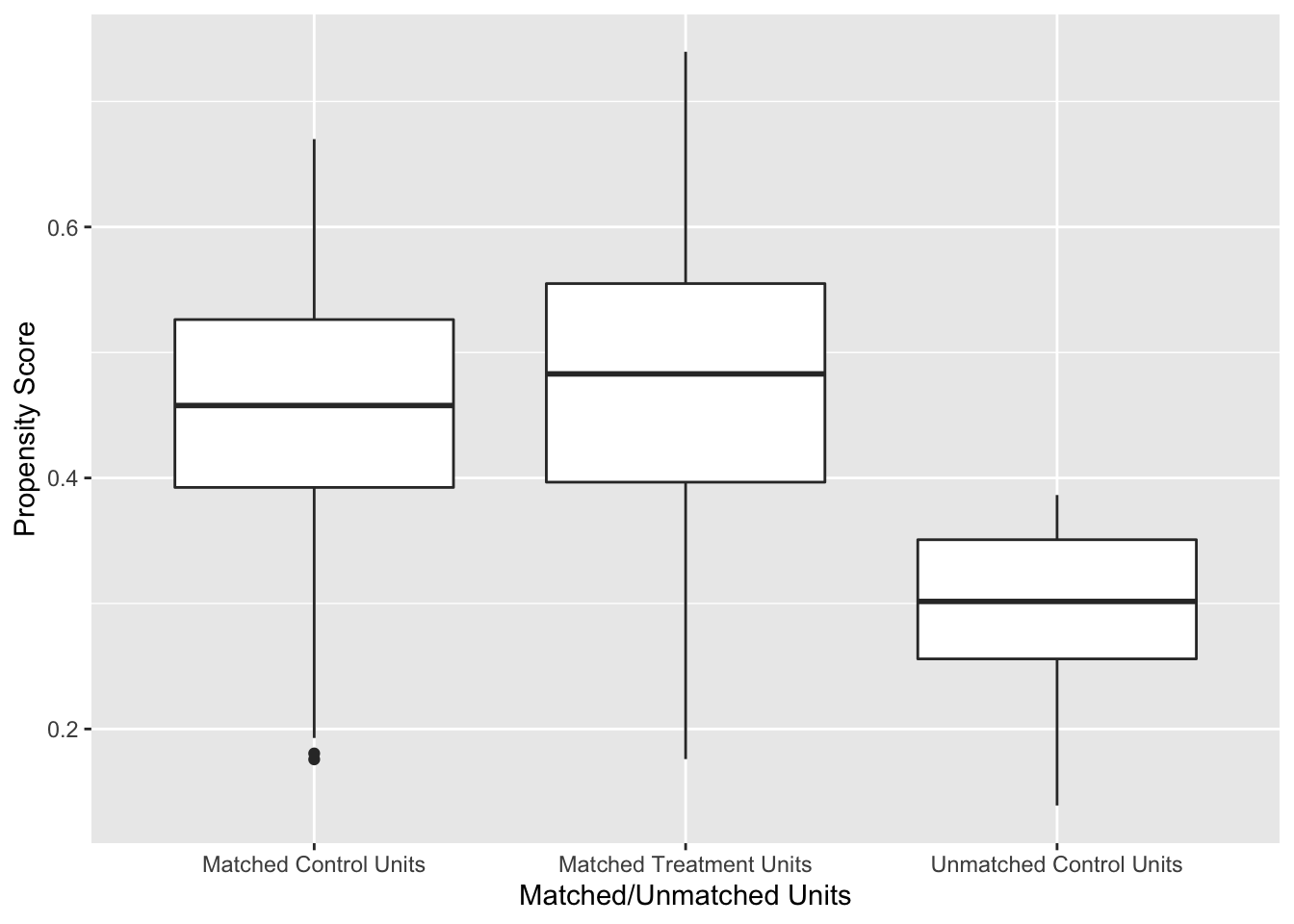
Figure 7.1: Distribution of Propensity Scores Using 1:1 Nearest Neighbour Matching on Propensity Score
Figure 7.1 shows the distribution of propensity scores in the matched and unmatched treatment and control groups. There is adequate overlap of the propensity scores with a good control match for each treated unit.
Checking covariate balance before and after the propensity score matching that was conducted in Section 7.7.4 is an important part of the design stage of an observational study that uses propensity score matching. Let’s write a function to compute (7.4) before and after matching.
The code chunk below computes the sample means and variances for each treatment group using group_by(urbanrural1982) with summarise(m = mean(age1982), v = var(age1982)); ungroup() then removes the grouping variable; the data frame is widened so that there is a column for each sample mean and variance, and (7.4) is calculated.
nhefs9282_propmoddat %>%
  group_by(urbanrural1982) %>%
  summarise(m = mean(age1982),
            v = var(age1982)) %>%
  ungroup() %>%
  pivot_wider(names_from = urbanrural1982,
              values_from = c(m, v)) %>%
  mutate(std_diff = 100 * abs((m_0 - m_1) /
                                sqrt((v_0 + v_1) / 2)))
Since we will want to do this with many variables, a function should be written. When programming with data - variables using the dplyr library, the argument needs to be embraced by surrounding it in double braces like {{ var }}. checkbal_continuous turns the code above into a function that can be used to check the covariate balance for a continuous variable in a data frame.
checkbal_continuous <- function(data, var1, trt) {
  data %>%
    group_by({{ trt }}) %>%
    summarise(m = mean({{ var1 }}),
              v = var({{ var1 }})) %>%
    ungroup() %>%
    pivot_wider(names_from = {{ trt }},
                values_from = c(m, v)) %>%
    mutate(std_diff = 100 * abs((m_0 - m_1) /
                                  sqrt((v_0 + v_1) / 2)))
}
We can use it to check the balance of age1982 before and after matching.
# before matching
checkbal_continuous(data = nhefs9282_propmoddat,
                    var1 = age1982,
                    trt = urbanrural1982)
#> # A tibble: 1 × 5
#>     m_0   m_1   v_0   v_1 std_diff
#>   <dbl> <dbl> <dbl> <dbl>    <dbl>
#> 1  52.1  49.5  137.  119.     22.7

# after matching
nhefs9282_propmoddat %>%
  left_join(pairs_out, by = "id") %>%
  filter(!is.na(pair)) %>%
  checkbal_continuous(age1982, urbanrural1982)
#> # A tibble: 1 × 5
#>     m_0   m_1   v_0   v_1 std_diff
#>   <dbl> <dbl> <dbl> <dbl>    <dbl>
#> 1  50.6  49.5  118.  119.     9.67
In this case, the percent improvement in balance is \(100 \times(22.67 - 9.67)/22.67=\) 57.3445082. Values greater than 0 indicate an improvement and values less than 0 indicate that the balance is worse after matching.
checkbal_discrete() is a function that can be used to check balance for discrete covariates.
checkbal_discrete <- function(data, trt, var){
  data %>%
    group_by({{ trt }}, {{ var }}) %>%
    count({{ var }}) %>%
    ungroup({{ var }}) %>%
    mutate(t = sum(n),
           p = n/t,
           v = p*(1-p)/t) %>%
    select({{ var }}, {{ trt }}, p, v) %>%
    pivot_wider(names_from = {{ trt }},
                values_from = c(p,v)) %>%
    mutate(std_diff = 100 *
             abs((p_1 - p_0) / sqrt((v_0 + v_1) / 2)))
}
# before matching
nhefs9282_propmoddat %>% checkbal_discrete(urbanrural1982, sex)
#> # A tibble: 2 × 6
#>     sex   p_0   p_1      v_0      v_1 std_diff
#>   <dbl> <dbl> <dbl>    <dbl>    <dbl>    <dbl>
#> 1     1 0.433 0.432 0.000178 0.000224     1.08
#> 2     2 0.567 0.568 0.000178 0.000224     1.08

# after matching
nhefs9282_propmoddat %>%
  left_join(pairs_out, by = "id") %>%
  filter(!is.na(pair)) %>%
  checkbal_discrete(urbanrural1982, sex)
#> # A tibble: 2 × 6
#>     sex   p_0   p_1      v_0      v_1 std_diff
#>   <dbl> <dbl> <dbl>    <dbl>    <dbl>    <dbl>
#> 1     1 0.433 0.432 0.000224 0.000224     6.10
#> 2     2 0.567 0.568 0.000224 0.000224     6.10
The balance for sex decreased after matching since \(100 \times(1.08 - 6.10)/1.08=\) -464.8148148. The large value should not be too concerning since the standardized difference changed from 1 to 6 which are both fairly low.
7.7.7 Analysis of the Outcome after Matching
The analysis should proceed as if the treated and control samples had been generated through randomization. Individual units will be well matched on the propensity score, but may not be matched on the full set of covariates. Thus, it is common to pool all the matches into matched treated and control groups and run analyses using these groups rather than individual matched pairs.75
Consider Example 7.9. Let \(y_{i}^{1982}\) and \(y_{i}^{1992}\) be the \(i^{th}\) subjects’ weights at baseline in 1982 and 1992. Two common statistical models to evaluate the effect of treatment \(T_i\) on weight gain are:
\[\begin{align} y_{i}^d &= \beta_0 +\beta_1T_i+\epsilon_i \tag{7.5}\\ y_{i}^{1992} &= \beta_0 +\beta_1T_i+ \beta_2y_i^{1982}+\epsilon_i, \tag{7.6} \end{align}\]
where \(y_i^{d} = y_i^{1992}-y_i^{1982}\), \(\epsilon_i \sim N(0, \sigma^2)\), and \(T_i\) is the treatment indicator for the \(i^{th}\) unit. Propensity score matching allows us to define \(T_i\) as an indicator of treated \(T=1\) or control \(T=0\) based on propensity score matching. If \(\beta_2=1\) in (7.6) then models (7.6) and (7.5) are equivalent.
7.7.8 Computation Lab: Analysis of Outcome after Matching
Analysis of the outcome is the final stage of implementing propensity score matching. Continuing with Example 7.9, by using the propensity score matching from Section 7.7.4 we can compare weight gain in people living in the city versus the suburbs.
The treatment and control groups from propensity score matching were created in Section 7.7.4 and stored in the data frame pairs_out. nhefs_ps is a data frame that contains the outcome variables, covariates, and propensity scores. It can be merged with the data on matching to create a data frame, df_anal, ready for analysis.
df_anal <- nhefs_ps %>%
  left_join(pairs_out, by = "id") %>%
  mutate(
    treat =
      case_when(
        !is.na(pair) & urbanrural1982 == 0 ~
          "Matched Control Units",
        !is.na(pair) & urbanrural1982 == 1 ~
          "Matched Treatment Units"
      )
  )
Fitting model (7.5),
mod_ttest_ps <- lm(wtgain ~ treat, data = df_anal)
broom::tidy(mod_ttest_ps, conf.int = TRUE)
#> # A tibble: 2 × 7
#> term estim…¹ std.e…² stati…³ p.value conf.…⁴ conf.…⁵
#> <chr> <dbl> <dbl> <dbl> <dbl> <dbl> <dbl>
#> 1 (Intercep… 3.12 0.523 5.97 2.69e-9 2.10 4.15
#> 2 treatMatc… 0.801 0.739 1.08 2.79e-1 -0.649 2.25
#> # … with abbreviated variable names ¹estimate, ²std.error,
#> # ³statistic, ⁴conf.low, ⁵conf.highThe estimate for the treatment effect is \(\bar y^{d}_{Treat} - \bar y^{d}_{Control}=\) 0.8. The estimate can also be calculated directly from the treatment means, but using lm() also computes inferential statistics.
df_anal %>%
  group_by(treat) %>%
  summarise(ybar_d = mean(wtgain),
            ybar_1982 = mean(wt1982),
            ybar_1992 = mean(wt1992))
#> # A tibble: 3 × 4
#>   treat                   ybar_d ybar_1982 ybar_1992
#>   <chr>                    <dbl>     <dbl>     <dbl>
#> 1 Matched Control Units    3.12       165.      168.
#> 2 Matched Treatment Units  3.92       161.      165.
#> 3 <NA>                     0.842      161.      162.
Fitting model (7.6),
mod_ancova <- lm(wt1992 ~ wt1982 + treat, data = df_anal)
broom::tidy(mod_ancova)
#> # A tibble: 3 × 5
#> term estim…¹ std.e…² stati…³ p.value
#> <chr> <dbl> <dbl> <dbl> <dbl>
#> 1 (Intercept) 16.7 1.86 8.97 6.21e-19
#> 2 wt1982 0.918 0.0108 84.7 0
#> 3 treatMatched Treatment U… 0.512 0.731 0.700 4.84e- 1
#> # … with abbreviated variable names ¹estimate, ²std.error,
#> # ³statisticThe treatment effect in this model is the difference between treated and control adjusted mean weights.
How does this compare to not using propensity score matching? We can fit models (7.5) and (7.6) using urbanrural1982 as the treatment indicator.
mod_ttest <- lm(wtgain ~ urbanrural1982, data = df_anal)
broom::tidy(mod_ttest)
#> # A tibble: 2 × 5
#>   term           estimate std.error statistic      p.value
#>   <chr>             <dbl>     <dbl>     <dbl>        <dbl>
#> 1 (Intercept)        2.65     0.480      5.53 0.0000000352
#> 2 urbanrural1982     1.27     0.721      1.76 0.0781
mod_ttest <- lm(wt1992 ~ wt1982 + urbanrural1982, data = df_anal)
broom::tidy(mod_ttest)
#> # A tibble: 3 × 5
#>   term           estimate std.error statistic  p.value
#>   <chr>             <dbl>     <dbl>     <dbl>    <dbl>
#> 1 (Intercept)      16.8      1.78        9.45 7.82e-21
#> 2 wt1982            0.914    0.0105     87.3  0
#> 3 urbanrural1982    1.03     0.712       1.45 1.48e- 1
The treatment effects are larger in the unadjusted analyses, but neither analyses indicate that there is evidence of a meaningful or statistically significant effect related to living in the suburbs versus the city.
7.7.9 Subclassification
7.7.9.1 Subclassification as a Method to Remove Bias
Consider a researcher who wishes to compare a response variable \(y\) in two treatment groups, but is concerned that the differences in the mean values of \(y\) in the groups may be due to other covariates \(x_1, x_2, \ldots\) in which the groups differ, rather than treatment \(T\). William G Cochran76 shows that if the distribution of a single covariate \(x\), that is independent of \(T\) but associated with \(y\), is broken up into five or more subclasses (e.g., using the quintiles) then 90% of the bias due to \(x\) is removed.
Example 7.11 (Smoking and Lung Cancer) The following data were selected from data supplied to the U. S. Surgeon General’s Committee from three of the studies in which comparisons of the death rates of men with different smoking habits were made.77 Table 7.8 shows the unadjusted death rates per 1,000 person-years. We might conclude that cigar and pipe smokers should give up smoking, but if they lack the strength of will to do so, they should switch to cigarettes.
| Smoking group | Canadian | British | U.S. |
|---|---|---|---|
| Non-smokers | 20.2 | 11.3 | 13.5 |
| Cigarettes only | 20.5 | 14.1 | 13.5 |
| Cigars, pipes | 35.5 | 20.7 | 17.4 |
Are there other variables in which the three groups of smokers may differ, that are related to the probability of dying; and that are not themselves affected by smoking habits?
The regression of probability of dying on age for men over 40 is a concave upwards curve, the slope rising more and more steeply as age advances. The mean ages for each group in the previous table are as follows. Table 7.9 shows that cigar or pipe smokers are older on average than the men in the other groups. In both the U.S. and Canadian studies which showed similar death rates in smokers and non-smokers, the cigarette smokers are youger than the non-smokers.
| Smoking group | Canadian | British | U.S. |
|---|---|---|---|
| Non-smokers | 54.9 | 49.1 | 57.0 |
| Cigarettes only | 50.5 | 49.8 | 53.2 |
| Cigars, pipes | 65.9 | 55.7 | 59.7 |
Table 7.10 shows the adjusted death rates obtained when the age distributions were divided into 9-11 subclasses (the maximum number of subclasses allowed by the data). The adjusted cigarette death rates now show a substantial increase over non-smoker death rates in all the studies.
| Smoking group | Canadian | British | U.S. |
|---|---|---|---|
| Non-smokers | 20.2 | 11.3 | 13.5 |
| Cigarettes only | 29.5 | 14.8 | 21.2 |
| Cigars, pipes | 19.8 | 11.0 | 13.7 |
7.7.9.2 Subclassification and the Propensity Score
Paul R Rosenbaum and Donald B Rubin78 extended the idea of subclassification to the propensity score and showed that creating subclasses based on the quintiles of the propensity score eliminated approximately 90% of the bias due to covariates used in developing the propensity score. One advantage of this method, compared to say matching on the propensity score, is that the whole sample is used and not just matched sets.
Covariate balance can be checked by comparing the distribution of covariates before and after subclassification. We can compare the treated and control groups on the covariates \(x_i\) used to build the propensity score model before and after stratification. The distributions before stratification can be evaluated by fitting a linear model.
\[\begin{equation} \mu_i = E(x_i) = \beta_0+\beta_1T_i. \tag{7.7} \end{equation}\]
The distributions after stratification can be evaluated by fitting
\[\begin{equation} \mu_i = E(x_i) = \beta_0+\beta_1T_i+\beta_2Q_i+\beta_3T_iQ_i, \tag{7.8} \end{equation}\]
where \(Q_i\) is the propensity score quintile for the \(i^{th}\) unit. The distributions for each covariate can be compared using the square of the t-statistic (or \(F\) statistic) for testing main effects of \(T\) in (7.7) and (7.8).
Once adequate covariate balance has been achieved using propensity score subclassification, the analysis of the main outcome \(y\) can be evaluated by separately computing the treatment effect within each propensity score quintile. The propensity score quintile can also be added as a covariate in order to compute an overall treatment effect adjusted for propensity score subclass.
7.7.10 Computation Lab: Subclassification and the Propensity Score
This section will illustrate subclassification using the propensity score with data from Example 7.9. The propensity scores and binary indicator variables for categorical covariates can be extracted from the propensity score model object propmod_nhefs.
The quintiles of the propensity score can be found using quantile().
ps_strat <-
  quantile(propmod_nhefs$fitted.values, c(0.2, 0.4, 0.6, 0.8))
ps_strat
#>       20%       40%       60%       80%
#> 0.3422608 0.4168620 0.4825014 0.5481783
The first subclass consists of units whose propensity score are less than or equal to 0.3422608, the second subclass consists of units whose propensity score is greater than 0.3422608 but less than or equal to 0.416862, etc. We can create the subclasses in R using mutate(). But, first we will extract the model.matrix from the propensity score model propmod_nhefs so that the covariates used to build the propensity score model are the dummy variables coded as 0/1 for reasons that will be explained below.
Covariates such as sex have been coded as as.factor(sex)2—as.factor(sex) coerces sex from a numeric variable to a factor variable using the contr.treatment() contrast function, where the number appended to the end of the column name is the baseline level, which in this case is female, since sex == 2 is female.
nhefs_psstratdf includes the covariates used in the model and propensity scores.
nhefs_psstratdf <-
  data.frame(
    cbind(
      propmod_nhefs$data$id,
      propmod_nhefs$y,
      propmod_nhefs$fitted.values,
      model.matrix(propmod_nhefs)[, 2:18]
    )
  )

colnames(nhefs_psstratdf) <-
  c("id", "urbanrural1982", "psscore",
    colnames(model.matrix(propmod_nhefs))[2:18])
nhefs_psstratdf is used to define propensity score strata based on ps_strat.
nhefs_ps <- nhefs_psstratdf %>%
  mutate(ps_subclass = case_when((psscore <= ps_strat[1]) ~ 1,
                                 (psscore > ps_strat[1] &
                                    psscore <= ps_strat[2]) ~ 2,
                                 (psscore > ps_strat[2] &
                                    psscore <= ps_strat[3]) ~ 3,
                                 (psscore > ps_strat[3] &
                                    psscore <= ps_strat[4]) ~ 4,
                                 (psscore > ps_strat[4]) ~ 5
  ))
The distribution of treated and control subjects within each subclass is obtained by grouping treatment and control using group_by(), counting using count(), and then applying pivot_wider() to the data frame to make the table easier to read.
nhefs_ps %>%
  group_by(ps_subclass, urbanrural1982) %>%
  count() %>%
  pivot_wider(names_from = ps_subclass, values_from = n)
#> # A tibble: 2 × 6
#> # Groups:   urbanrural1982 [2]
#>   urbanrural1982   `1`   `2`   `3`   `4`   `5`
#>            <dbl> <int> <int> <int> <int> <int>
#> 1              0   344   310   283   240   201
#> 2              1   151   184   211   255   293
Since 6 of the 7 covariates are categorical variables, they are represented as \(k-1\) dummy variables, where \(k\) is the number of categories, in the propensity score model, resulting in a total of 17 covariates that will be compared.
An efficient way to code the computation for fitting the models and extract the F statistics, without having to write out 17 model statements twice, is to use purrr::map() or lapply().
bal_prestrat <- nhefs_ps %>%
  select(4:20) %>%
  map(~ glm(.x ~ nhefs_ps$urbanrural1982, data = nhefs_ps)) %>%
  map(summary) %>%
  map(coefficients)
nhefs_ps %>% select(4:20) selects the covariates from nhefs_ps according to their column position and then the models are fit using map(~ glm(.x ~ nhefs_ps$urbanrural1982, data = nhefs_ps)) (.x is the argument for the columns selected in nhefs_ps), computes the summaries of each model map(summary) (which contain the desired t-statistic for \(T\)), and finally extracts the coefficients map(coefficients).
The t-statistics are in the second row, third column of each model summary in the list of 17 model summaries bal_prestrat. map(1:17, ~bal_prestrat[[.x]][2,3]) extracts the t-statistics into a list, squares and rounds each t-statistic to compute the F-statistic, and then converts the list to a vector purrr::flatten_dbl().
bal_poststrat <- nhefs_ps %>%
  select(4:20) %>%
  map( ~ glm(.x ~ nhefs_ps$urbanrural1982 * nhefs_ps$ps_subclass,
             data = nhefs_ps)) %>%
  map(summary) %>%
  map(coefficients)

Fpoststrat <- map(1:17, ~ bal_poststrat[[.x]][2, 3]) %>%
  map(~ round(.x ^ 2, 4)) %>%
  flatten_dbl()
We can examine the distribution of F statistics before stratification,
summary(Fprestrat)
#>    Min. 1st Qu.  Median    Mean 3rd Qu.    Max.
#>  0.0001  1.9762  6.6165  9.6957 12.4428 44.9352
and after stratification.
summary(Fpoststrat)
#>    Min. 1st Qu.  Median    Mean 3rd Qu.    Max.
#>  0.0111  0.2869  0.9937  2.6201  1.7253 20.5782
The median of the F statistics decreased from 6.62 to 0.994 suggesting that stratification has increased covariate balance, although not all the covariates’ balance improved.
The treatment effects for each subclass are computed below.
psstrat_df <- nhefs_ps %>%
  select(id, ps_subclass) %>%
  left_join(nhefs9282_propmoddat, by = "id") %>%
  select(ps_subclass, wtgain, wt1982, wt1992, urbanrural1982)

psstrat_df %>%
  split(psstrat_df$ps_subclass) %>%
  map( ~ lm(wtgain ~ urbanrural1982, data = .)) %>%
  map(summary) %>% map(coefficients)
#> $`1`
#>                 Estimate Std. Error    t value  Pr(>|t|)
#> (Intercept)    -1.648256   1.089202 -1.5132698 0.1308519
#> urbanrural1982 -0.669625   1.972070 -0.3395543 0.7343368
#>
#> $`2`
#>                Estimate Std. Error  t value  Pr(>|t|)
#> (Intercept)    1.477419   1.065794 1.386215 0.1663091
#> urbanrural1982 1.886711   1.746336 1.080383 0.2805010
#>
#> $`3`
#>                  Estimate Std. Error   t value    Pr(>|t|)
#> (Intercept)     3.0918728   1.023067  3.022162 0.002640574
#> urbanrural1982 -0.6558538   1.565403 -0.418968 0.675422340
#>
#> $`4`
#>                 Estimate Std. Error   t value     Pr(>|t|)
#> (Intercept)    5.7708333   1.038785 5.5553684 4.538711e-08
#> urbanrural1982 0.7468137   1.447299 0.5160052 6.060821e-01
#>
#> $`5`
#>                 Estimate Std. Error    t value     Pr(>|t|)
#> (Intercept)     7.487562   1.062313  7.0483556 6.152213e-12
#> urbanrural1982 -1.180395   1.379375 -0.8557463 3.925547e-01
Instead of using wtgain as the outcome, wt1992 and wt1982 could be used in an ANCOVA model.
7.8 Exercises
Exercise 7.1 Suppose \(N\) experimental units are randomly assigned to treatment or control by tossing a coin. A unit is assigned to treatment if the coin toss comes up heads. Assume that the probability of tossing a head is \(p\).
If \(p=1/3\), then are all treatment assignments equally likely?
Identify treatment assignments that do not allow estimating the causal effect of treatment versus control. Explicitly state the treatment assignment vectors for the identified assignments. How many of them are there?
Exercise 4.10 Consider the two treatment assignment mechanisms (7.1) and (7.2). What is the probability \(P(T_i=1)\) in each case? What is \(P(T_i=1 | Y_i(0) > Y_i(1))\)? Explain how you arrived at your answers.
Exercise 7.2 Consider the data shown in Table 7.2 in Example 7.2. Compute the randomization distribution of the mean difference based on the following treatment assignment mechanisms:
Completely randomized where 2 units are assigned to treatments randomly;
Randomized based on the mechanism described in Example 7.7 where the random selection depends on the potential outcomes. Does adding randomness to the treatment assignment remove the effect of the confounded treatment assignment in (7.1)?
Exercise 7.3 (Adapted from Gelman and Hill79, Chapter 9) Suppose you are asked to design a study to evaluate the effect of the presence of vending machines in schools on childhood obesity. Describe randomized and non-randomized studies to evaluate this question. Which study seems more feasible and easier to implement?
Exercise 7.4 (Adapted from Gelman and Hill80, Chapter 9) The table below describes a hypothetical experiment on 2400 persons. Each row of the table specifies a category of person, as defined by their pre-treatment predictor \(x\), treatment indicator \(T\), and potential outcomes \(Y(0)\) and \(Y(1)\).
| Category | Persons in category | \(x\) | \(T\) | \(Y(0)\) | \(Y(1)\) |
|---|---|---|---|---|---|
| 1 | 300 | 0 | 0 | 4 | 6 |
| 2 | 300 | 1 | 0 | 4 | 6 |
| 3 | 500 | 0 | 1 | 4 | 6 |
| 4 | 500 | 1 | 1 | 4 | 6 |
| 5 | 200 | 0 | 0 | 10 | 12 |
| 6 | 200 | 1 | 0 | 10 | 12 |
| 7 | 200 | 0 | 1 | 10 | 12 |
| 8 | 200 | 1 | 1 | 10 | 12 |
In making the table we are assuming omniscience, so that we know both \(Y(0)\) and \(Y(1)\) for all observations. But the (non-omniscient) investigator would only observe \(x\), \(T\), and \(Y(T)\) for each unit. For example, a person in category 1 would have \(x = 0\), \(T = 0\), and \(Y(0)=4\), and a person in category 3 would have \(x = 0\), \(T = 1\), and \(Y(1)=6\).
Give an example of a context for this study. Define \(x, T, Y(0), Y(1)\).
Calculate the the average causal treatment effect using R.
Is the covariate \(x\) balanced between the treatment groups?
Is it plausible to believe that these data came from a randomized experiment? Defend your answer.
Another population quantity is the mean of \(Y\) for those who received the treatment minus the mean of \(Y\) for those who did not. What is the relation between this quantity and the average causal treatment effect?
For these data, is it plausible to believe that treatment assignment is ignorable given the covariate \(x\)? Defend your answer.
Exercise 7.5 What is the definition of ignorable treatment assignment?
Give an example of a study where the treatment assignment is ignorable.
Give an example of a study where the treatment assignment is non-ignorable.
Exercise 7.6 (Adapted from Gelman and Hill81, Chapter 9) An observational study to evaluate the effectiveness of supplementing a reading program with a television show was conducted in several schools in grade 4. Some classroom teachers chose to supplement their reading program with the television show and some teachers chose not to supplement their reading program. Some teachers chose to supplement if they felt that it would help their class improve their reading scores. The study collected data on a large number of student and teacher covariates measured before the teachers chose to supplement or not supplement their reading program. The outcome measure of interest is student reading scores.
Describe how this study could have been conducted as a randomized experiment.
Is it plausible to assume that supplementing the reading program is ignorable in this observational study?
Exercise 7.7 The following questions refer to Section 7.7.4 Computation Lab: Nearest Neighbour Propensity Score Matching.
- When matching the treatment and control groups,
which.min(diff)was used in code chunk below. What does the functionwhich.min()return? Explain the purpose of the line.
for (i in 1:nrow(df_trt)) {
  if (i == 1) {
    df_cnt1 <- df_cnt
  } else if (i > 1) {
    df_cnt1 <- df_cnt1[-k1,]
  }

  diff <- abs(df_trt$psscore[i] - df_cnt1$psscore)
  k1 <- which.min(diff)

  pairs_out$id[2 * i - 1] <- df_trt$id[i]
  pairs_out$id[2 * i] <- df_cnt1$id[k1]
  pairs_out$pair[c(2 * i - 1, 2 * i)] <- i
  pairs_out$trt[c(2 * i - 1, 2 * i)] <- c(1, 0)
}
2 * i -1and2 * iplace \(i^{th}\) matched treatment and control units respectively. Explain why.Modify the matching code to use the logit of the propensity score, and run the matching algorithm again. Do the results change?
Evaluate the parallelism assumption in
mod_ancova. What do you conclude?Compute the adjusted difference in mean weight gain using
mod_ancova. Verify that you obtain the same value as the parameter estimate when using sample means.
Exercise 7.9 Consider the data from Example 7.9. In Section 7.7.4 Computation Lab: Nearest Neighbour Propensity Score Matching,
marital1982 was included when fitting the propensity score model propmod_nhefs. Suppose a (naive) investigator forgot to include marital1982 in a propensity score model.
Fit a new propensity score model without
marital1982.Use the propensity scores from a. to match treatment and control units using nearest neighbour matching.
Check covariate balance post matching and compare with the results from Section 7.7.4 Computation Lab: Checking Overlap and Covariate Balance.
Estimate the treatment effect using the model specified in Equation (7.5) and compare with the results from Section 7.7.4 Computation Lab: Analysis of Outcome after Matching. How does including
marital1982alter the estimate of treatment effect.
Exercise 7.10 In Section 7.7.4 Computation Lab: Nearest Neighbour Propensity Score Matching, a propensity score model for the data from Example 7.10 was fit. The model is stored in propmod_nhef and the data is stored in nhefs9282_propmoddat.
Extract the model matrix from
propmod_nhefsusingmodel.matrix().Verifiy that the sex covariate value 1 from
nhefs9282_propmoddatis mapped to value 0 of the dummy variable in the model matrix and the covariate value 2 is mapped to 1. You can verify the mapping by crosstabulating the original covariate values and the dummy variable values.
Exercise 7.11 Consider the data from Example 7.10 and the propensity score model fitted in Section 7.7.4 Computation Lab: Nearest Neighbour Propensity Score Matching.
Create five subclasses based on the quintiles of the propensity score.
Within each propensity score subclass, fit the ANCOVA model as described in Equation (7.6). Compare the results you obtain with results from Section 7.7.10 Computation Lab: Subclassification and the Propensity Score.
-
Fit the models to estimate the overall treatment effect adjusting for the propensity score subclasses as shown in Equation (7.9) and Equation (7.10). Interpret your findings.
\[\begin{align} y_{i}^d &= \beta_0 +\beta_1T_i+\beta_2S_i\epsilon_i \tag{7.9}\\ y_{i}^{1992} &= \beta_0 +\beta_1T_i+ \beta_2S_i + \beta_3y_i^{1982}+\epsilon_i, \tag{7.10} \end{align}\]
where \(y_i^{d} = y_i^{1992}-y_i^{1982}\), \(\epsilon_i \sim N(0, \sigma^2)\), \(T_i\) is the treatment indicator, and \(S_i\) is the propensity score subclass for the \(i^{th}\) unit.
Estimate the overall treatment effect using the five subclass treatment effects from part b. Compare the estimates with the results from part c.